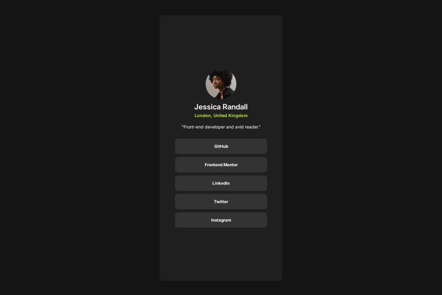


Design comparison

Solution retrospective
I'm most proud of how I successfully structured the layout using Flexbox while keeping it responsive across different screen sizes. Fixing the avatar overflow issue without relying on position: relative was a key moment for me.
Next time, I would focus more on refining the design with CSS Grid, experimenting with animations for smoother user interactions, and improving accessibility features to make the project more inclusive.
What challenges did you encounter, and how did you overcome them?One major challenge was handling the avatar positioning, as it initially moved out of the header container when viewed on GitHub Pages. I resolved this by removing unnecessary top and overflow properties and instead using margin-bottom strategically to maintain alignment.
Another challenge was ensuring consistent spacing across elements. By adjusting margin and padding values while keeping a mobile-first approach, I managed to create a balanced and structured layout.
What specific areas of your project would you like help with?I would love feedback on:
- CSS best practices: Are there more efficient ways to structure my CSS for better maintainability?
- Accessibility improvements: What changes can I make to improve keyboard navigation and screen reader compatibility?
- Performance optimization: Any tips for making the page load faster, especially for mobile users?
Community feedback
Please log in to post a comment
Log in with GitHub
Join our Discord community
Join thousands of Frontend Mentor community members taking the challenges, sharing resources, helping each other, and chatting about all things front-end!
Join our Discord