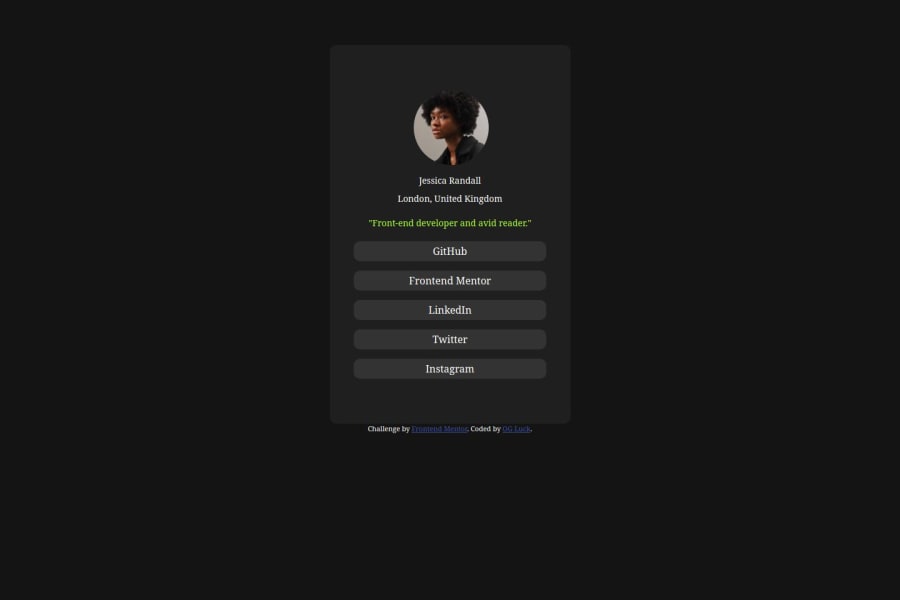
responsive social links profile using Html and css
Design comparison
Community feedback
- @Ezekiel225Posted about 1 year ago
Hello there 👋 @OGluck20.
Good job on completing the challenge !
Your project looks really good!
I have suggestions about your code that might interest you.
📌Using margin is not the best option to center an element. Here's a very efficient (and better) way to place an element in the middle of the page both vertically and horizontally:
📌 Apply this to the body element (in order to work properly, don't use position or margins):
body {
    min-height: 100vh;
    display: flex;  /* it works with grid too  */
    justify-content: center;
    align-items: center;
}
I hope this suggestion is useful for future projects.
Other than that, great job!
Keep up the excellent work and continue to challenge yourself with new projects. Your progress is impressive, and each project is a step forward in your front-end development journey! 🚀🌟.
Happy coding.
0
Please log in to post a comment
Log in with GitHubJoin our Discord community
Join thousands of Frontend Mentor community members taking the challenges, sharing resources, helping each other, and chatting about all things front-end!
Join our Discord
