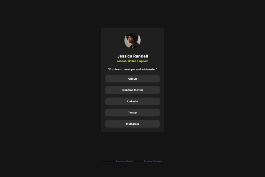
Responsive Social Links Profile using Flexbox and CSS Custom propertie
Design comparison
Solution retrospective
I am most proud of the responsiveness and accessibility features I implemented in this project. By using semantic HTML5 and ensuring that all interactive elements have hover and focus states, I enhanced the user experience for a wider audience. Additionally, the use of CSS custom properties allowed for a cleaner and more maintainable codebase.
Next time, I would consider exploring additional animations for hover states to make the interaction more engaging. Lastly, I want to experiment with more advanced CSS techniques, such as CSS Grid, to improve layout control.
What challenges did you encounter, and how did you overcome them?I didn't really face any significant challenges.
What specific areas of your project would you like help with?I would love to get feedback on any improvements and best practices I can implement to improve my skills.
Community feedback
- @naveenkkannanPosted 6 months ago
Great job on the responsiveness and accessibility, using semantic HTML5 and CSS custom properties for clean code. Keep refining animations, layouts, and code scalability—you're on the right track!
0
Please log in to post a comment
Log in with GitHubJoin our Discord community
Join thousands of Frontend Mentor community members taking the challenges, sharing resources, helping each other, and chatting about all things front-end!
Join our Discord
