Not Found
Not Found
Not Found
Not Found
Not Found
Not Found
Not Found
Not Found
Not Found
Not Found
Not Found
Not Found
Not Found
Not Found
Not Found
Not Found
Not Found
Not Found
Not Found
Not Found

Submitted

Responsive Social links profile using flexbox

Sagi 120

@ratsagi

Desktop design screenshot for the Social links profile coding challenge

This is a solution for...

  • HTML
  • CSS
1newbie
View challenge

Design comparison


SolutionDesign

Solution retrospective


What are you most proud of, and what would you do differently next time?

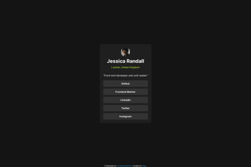
I am proud of completing this challenge. I could build out this social link profile and got it looking as close to the design as possible.

What challenges did you encounter, and how did you overcome them?

I used to have figma file from previous challenges so It was challenging at first how to get a right size then I had a look at the design of qr code component and noticed the similarites of the size of their container and I used it as an example after I just worked with jpg so the key point here is I could learn to use my best jugment of the size to create this project.

What specific areas of your project would you like help with?

From my point of view this challenge has been done with high quality. If you disagree let me know.

Community feedback

Daniel 🛸 44,230

@danielmrz-dev

Posted

Hello there!

Congrats on completing the challenge!

Your solution looks great!

📌 It's recommended to use semantic HTML elements like <ul> and <li> for creating lists. This ensures that your code is more accessible, maintainable, and semantically meaningful.

Here's and example on how you can refactor your code:

After Refactoring

<ul class="list-container">
    <li><a href="#">Github</a></li>
    <li><a href="#">Frontend Mentor</a></li>
    <li><a href="#">LinkedIn</a></li>
    ...
</ul>

By using <ul> and <li>, you convey the structure of your content more clearly, making it easier for screen readers and search engines to understand. Additionally, it aligns with best practices for HTML semantics.

I hope you find this helpful!

Keep up the excellent work!

Marked as helpful

0
T

@gmagnenat

Posted

Hi, congrats on completing this challenge! 🎉

I checked your repo and can give you a few comments on your solution.

Does the solution include semantic HTML?

  • ✅ There is a main landmark
  • 🔶 The avatar could use a better alt in my opinion. like the person name maybe?
  • ✅ Good use of the bloquote element :)

The links is a list of links. You could wrap them in an <ul> and use <li> for each link.

Is it accessible, and what improvements could be made?

  • ✅ relative units are used.
  • The link are hardly readable when hovered or focus. I would update the text color to a dark color for these interaction states.

Does the layout look good on a range of screen sizes? yes.

Is the code well-structured, readable, and reusable? I would not add the css file in the /assets directory but keep it at the root of the folder in your current structure. Use the /assets for images and fonts.

You can use a modern css reset to make your life easier later with different spacing and sizing issue between browsers.

I suggest you use scoped classnames for the different elements it will make your code more readable and reusable. For example you don't want to change all the <p> tag to green but only some specific ones. Currently it makes it difficult to understand quickly if we want to do an update.

Does the solution differ considerably from the design?

There are some difference from the design and it looks smaller. To help you can use a tool like This perfectPixel chrome extension. You can use the file from the /design folder to compare to your actual solution.

I hope you find my comments helpful for improving your solution and your future challenges. Don't hesitate to reach out if you have any questions.

Happy coding !

Marked as helpful

0

Sagi 120

@ratsagi

Posted

@gmagnenat, thank you for your detailed feedback. I modified my solution. However, I am having an issue with the size of container which I am not able to change by max-width. If I set width it starts to overflow. I tried to use clamp function but it doesn't help. Could you help me to find the solution of this problem?

0
T

@gmagnenat

Posted

@ratsagi Hi, I don't understand your issue.

  • I cloned your website
  • commented your clamp value
  • uncommented your max-width:40rem

It works fine as expected.. so can you explain a bit more what's your issue?

I would remove the position:fixed in your footer too as it may overflow on the card when font size setting is increased.

0
Sagi 120

@ratsagi

Posted

@gmagnenat Hello, as you mentioned in previous comment. It looks smaller in size compare to design so I would like to increase it by changing max-width however it doesn't effect (Even if I remove it the size stays the same) . After that I considered to declare width with clamp but here horizontal scroll showed up. Now I don't know how to make it bigger in terms of size.

0

Please log in to post a comment

Log in with GitHub
Discord logo

Join our Discord community

Join thousands of Frontend Mentor community members taking the challenges, sharing resources, helping each other, and chatting about all things front-end!

Join our Discord