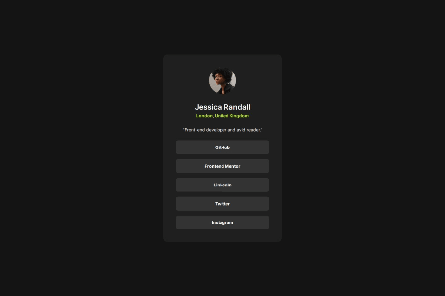
Design comparison
Solution retrospective
I've been trying to research more about responsive units and accessibility. I've changed a few things in how I write the code compared to what I did before my research. And I think that I've improved a bit.
I want to use grid more in the future. It's also important to me to continue to learn about best practices and accessibility.
Units like rem and em are still a little unclear to me. I understand what they do. But I don't fully understand when to use what and why. I need to do some more research!
During this project, I learned about the 62.5% Font Size Trick. After reading about this topic I understood that this trick is not as great as it sounds. Grace Snow wrote a great article about why. A few articles recommended using CSS variables instead. I can see the advantage of this, especially if I'm using utility classes for the project.
Speaking of utility classes. I just learned that they exist. They don't seem useful for small projects like this one, but I will definitely use them in the future.
I have also been researching when to use grid or flexbox since I'm almost exclusively using flexbox right now. Kevin Powell made an amazing video diving deep into this.
I would love to read more about utility classes, responsive units, and accessibility. If someone has some good articles on these topics, please send them my way!
I would also appreciate if someone could answer the following:
- Is there anywhere in my code where it could have been beneficial to use
gridinstead offlexbox? - Is it a good idea to set up utility classes and a more comprehensive CSS reset for smaller projects like this one?
- Are there any accessibility improvements I could make to my project?
Community feedback
Please log in to post a comment
Log in with GitHubJoin our Discord community
Join thousands of Frontend Mentor community members taking the challenges, sharing resources, helping each other, and chatting about all things front-end!
Join our Discord
