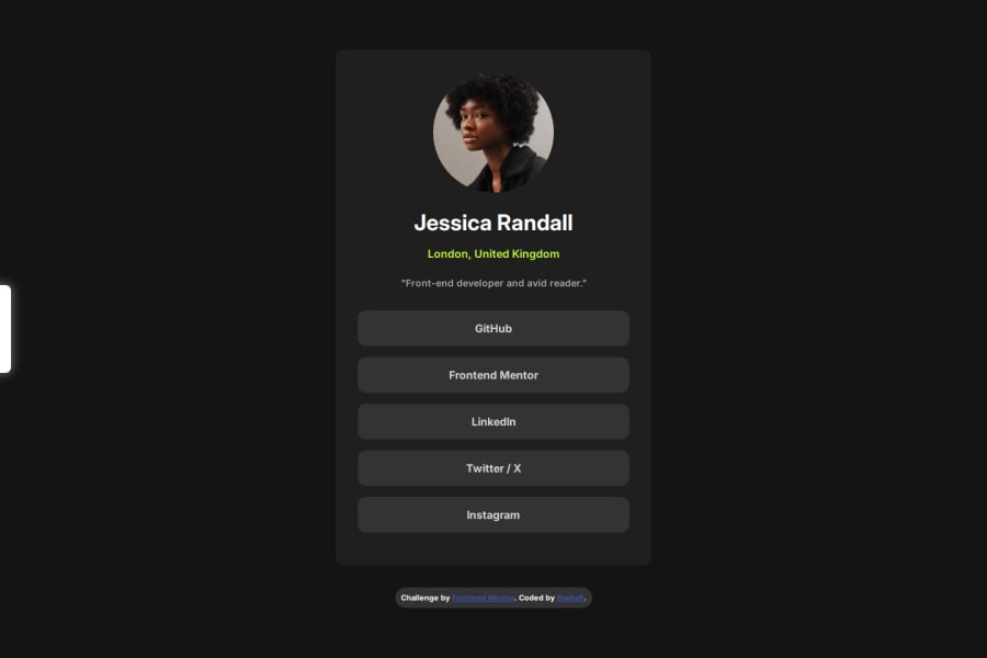
responsive Social Links Profile Page Using HTML and CSS
Design comparison
Solution retrospective
I'm Glad I could make the design the closest possible to the project preview with a short time building and designing
What challenges did you encounter, and how did you overcome them?the small screens of mobile sometimes cause issues with the width of the main box that holds content, a few tries and i got the hang of the media screen sizes and the automatic change of the width depending on the screen size without being stuck on a specific size even when a media is defined
Community feedback
- P@StroudyPosted 8 months ago
Great job using the correct units instead of
px, Its bad practice to useid=""instead ofclass=""for styling purposes, have a look at BEM naming convention. Your links are not accessible using the tab key, that is a major accessibility issue that can easily be fixed for your next project. Take these as areas to look at for improvement, keep coding!Marked as helpful0
Please log in to post a comment
Log in with GitHubJoin our Discord community
Join thousands of Frontend Mentor community members taking the challenges, sharing resources, helping each other, and chatting about all things front-end!
Join our Discord
