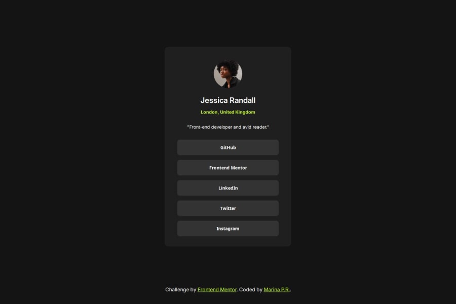
Responsive social links profile created with HTML and CSS


Design comparison

Solution retrospective
I'm feeling more comfortable using flexbox.
What challenges did you encounter, and how did you overcome them?I get a bit confused when using @media for responsiveness.
What specific areas of your project would you like help with?Any feedback is always welcome!
Community feedback
- @Bene001700Posted 18 days ago
Bom trabalho! Só uma sugestão. Tiraria o "height : 100vh" do body. Não sei por qual motivo ele faz com que o conteiner fique colado no topo. Mas é um bom trabalho. Parabéns.
Marked as helpful1@MarinaPerezRPosted 17 days ago@Bene001700 Muito obrigada! I will consider your advice!
0 - @RemyJuanesPosted 19 days ago
The only difference I can see is the links's height, they seem to be just 2 or 3 pixels bigger, good job !!!
In the HTML:
You use lot of div tags instead of semantic tags like main for your container. You can wrap you img in a figure and the text inside a figcaption.
The links are supposed to be a tags, this way, users can click on it to be redirected. If you use button, you had to use JavaScript in order to open a new page
In the CSS:
Your CSS file is short, that's a good point for readability. You can use CSS variable declaration to avoid style repetition.
Marked as helpful1@MarinaPerezRPosted 18 days ago@RemyJuanes Thank you so much for your feedback and your time! I will take all your advice into account 🙏🏻
0


Please log in to post a comment
Log in with GitHubJoin our Discord community
Join thousands of Frontend Mentor community members taking the challenges, sharing resources, helping each other, and chatting about all things front-end!
Join our Discord