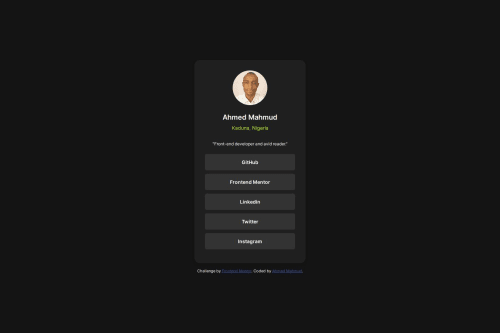
Responsive Social Links Profile Card with Flexbox and Semantic HTML

Solution retrospective
I'm most proud of being able to achieve the design with minimal challenges. The process went smoothly, and I was able to implement the social links profile card effectively using my existing knowledge of HTML, CSS, and Flexbox. Next time, I would explore incorporating more advanced CSS techniques or adding animations to enhance the user experience.
What challenges did you encounter, and how did you overcome them?There were no significant challenges encountered during this project. My experience from the QR code component and blog preview card projects helped streamline the process and avoid common pitfalls.
What specific areas of your project would you like help with?I would appreciate feedback on code improvement, particularly in optimizing the CSS and HTML structure. Any suggestions on best practices or alternative approaches to achieve a cleaner and more efficient codebase are welcome.
Please log in to post a comment
Log in with GitHubCommunity feedback
No feedback yet. Be the first to give feedback on Ahmed Mahmud's solution.
Join our Discord community
Join thousands of Frontend Mentor community members taking the challenges, sharing resources, helping each other, and chatting about all things front-end!
Join our Discord