

Design comparison
SolutionDesign

Solution retrospective
What are you most proud of, and what would you do differently next time?
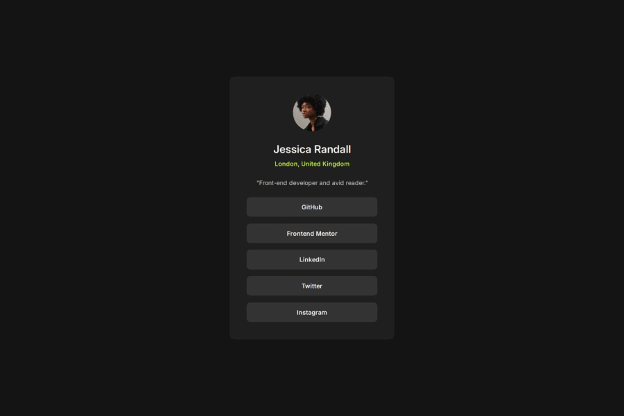
Not very proud but I managed to catch good gradients to display proper design for instagram and linedin buttons.
What challenges did you encounter, and how did you overcome them?I stumbled on making gradiend-colored buttons fade-in and fade-out smoothly, beccause you can't transition any linier-gradient() result. I have found a way around by creating a clone-button with needed background and using on :hover not to change background from default to special but to remove it from default to background: none;. It is possible to apply transition to background: none; so the visual effect is just the same!
Community feedback
Please log in to post a comment
Log in with GitHub
Join our Discord community
Join thousands of Frontend Mentor community members taking the challenges, sharing resources, helping each other, and chatting about all things front-end!
Join our Discord