Submitted about 1 year ago
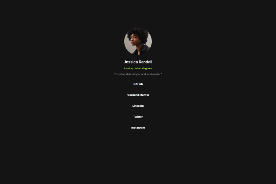
Responsive Social Links Profile.
@JaviVaSu
Design comparison
SolutionDesign
Solution retrospective
What are you most proud of, and what would you do differently next time?
I am proud that I can make the designs more easily.
What challenges did you encounter, and how did you overcome them?Aligning the content was what was most difficult for me
What specific areas of your project would you like help with?In the management of the FlexBox and Grid
Please log in to post a comment
Log in with GitHubCommunity feedback
No feedback yet. Be the first to give feedback on Javier Alberto Vásquez Suárez's solution.
Join our Discord community
Join thousands of Frontend Mentor community members taking the challenges, sharing resources, helping each other, and chatting about all things front-end!
Join our Discord
