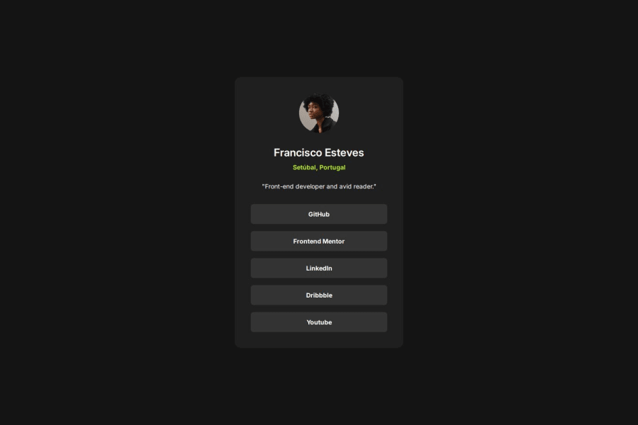
Design comparison
Solution retrospective
I’m proud that I was able to create a layout that closely resembles the intended solution, even without access to the Figma file.
Next time, I would prioritize obtaining the Figma file or any design specifications before starting the project. Having access to the design resources would make it significantly easier to match font weights, colors, and overall layout accurately.
What challenges did you encounter, and how did you overcome them?Example: Styling List Items:
Initially, the list items were taking the full width of the container, which was not the intended design.
I researched how to use Flexbox effectively for the list items and adjusted their CSS properties. By changing the display property and changing the width setting to percentage, I was able to achieve the desired layout.
What specific areas of your project would you like help with?CSS Grid Implementation:
I would like guidance on how to effectively implement CSS Grid for layout management, even for this very project.
Accessibility Improvements:
I also seek advice on enhancing the accessibility of my project.
Community feedback
Please log in to post a comment
Log in with GitHubJoin our Discord community
Join thousands of Frontend Mentor community members taking the challenges, sharing resources, helping each other, and chatting about all things front-end!
Join our Discord
