Design comparison
Solution retrospective
Tips or constructive criticism will be appreciated.
Community feedback
- P@bluethreadmadePosted 8 months ago
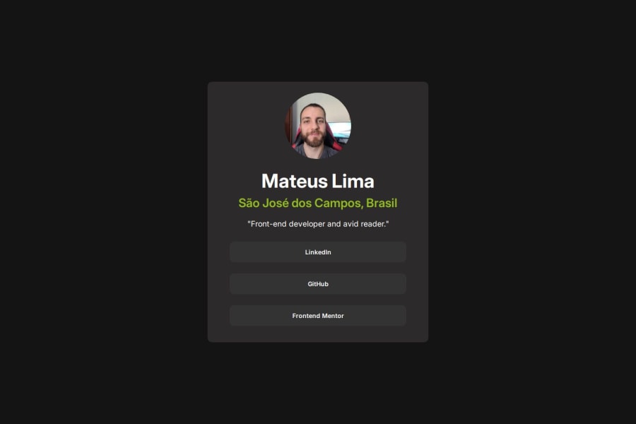
Your solution looks great. I like how you customized it.
I think you increased the font size on the location from the design spec but that seems like it was on purpose.
I think you could improve your links by making them span the width of the box around them. I thought they were broken because when I hovered anywhere in the box, the color changed, but clicking anywhere doesn't open the link, you must click on the text to open the link.
0@mts-mlPosted 8 months agoHey Megan, thanks for the feedback.
Yeah, I preferred the size bigger.
About the links, I'm researching it now, it's not a great experience having to click on the text to open the link.
0
Please log in to post a comment
Log in with GitHubJoin our Discord community
Join thousands of Frontend Mentor community members taking the challenges, sharing resources, helping each other, and chatting about all things front-end!
Join our Discord
