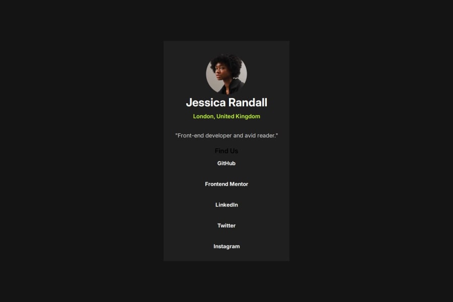
Design comparison
Solution retrospective
I am proud of having finished it with quality in less time than the previous ones, even without having the Figma file.
If I were starting now, I would probably use CSS Grid combined with Flexbox because it would make positioning the elements easier and faster.
What challenges did you encounter, and how did you overcome them?It was a layout that was essentially in lines. I challenged myself to use only Flexbox to solve it. I had to watch some classes and consult references on how Flexbox works. I asked questions in the GPT Chat mainly about how relative measurements work. Several sources of reference.
What specific areas of your project would you like help with?This particular project is pretty straightforward. I think I just need to practice more by doing other projects.
Community feedback
- @Grimm-NPosted 5 months ago
Your project is coming along great—seriously, amazing work! 🎉 It’s awesome to see your progress and dedication.
Here are a few tips to keep leveling up:
1️⃣ Quality > Speed, every time. It’s better to take your time and nail it than rush and miss details. 🚀
2️⃣ Stick to the design! Following the layout for sizes, placement, and functionality not only builds your skills but also pushes you to think like a pro designer. 🎨
3️⃣ Pro tip: Even without Figma files, the screenshots of the original design are gold. Use them wisely to match element sizes and spacing. 📐
4️⃣ Ditch the pixels! Opt for responsive units like
em,rem, or%. They’re more flexible and help your design shine on any screen size. ✨5️⃣ For smaller screens, try setting the card width to
90vwor90%. It’ll keep things clean and prevent that awkward sticking-to-the-edges look.Keep going—you’re crushing it! 💪🌟
Marked as helpful1
Please log in to post a comment
Log in with GitHubJoin our Discord community
Join thousands of Frontend Mentor community members taking the challenges, sharing resources, helping each other, and chatting about all things front-end!
Join our Discord
