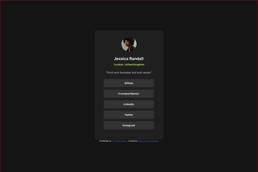
Design comparison
Solution retrospective
working with flexbox.
What challenges did you encounter, and how did you overcome them?aligning html elements properly.
What specific areas of your project would you like help with?layout design and implementation.
Community feedback
- @danielmrz-devPosted 6 months ago
Hello there!
Congrats on completing the challenge! ✅
Your solution looks great!
I have a suggestion for improvement:
📌 Think about using
<main>to wrap your main content instead of<div>.Imagine
<div>and<span>in HTML as basic containers. They're good for holding stuff, but they don't tell us much about what's inside or its purpose on the webpage.This change might not have impact on how your page looks, but it'll make your HTML code clearer and help with SEO and accessibility.
Hope that's helpful!
Keep up the great work!
0@sampath-karupakulaPosted 6 months ago@danielmrz-dev, Thank you for feedback. will keep them in mind. I treated it as a card to integrate so used div instead of main tag. will use main tags next time onwards.
0
Please log in to post a comment
Log in with GitHubJoin our Discord community
Join thousands of Frontend Mentor community members taking the challenges, sharing resources, helping each other, and chatting about all things front-end!
Join our Discord
