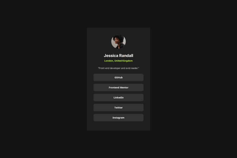
Design comparison
SolutionDesign
Solution retrospective
What are you most proud of, and what would you do differently next time?
I did it in a short time with no many difficulties. Maybe calculate better the height distances, as I measured it many times and I think there's something wrong.
What challenges did you encounter, and how did you overcome them?I thought it would be more difficult to build but following the process of creating containers and wrapping elements inside other boxes it was so easy.
What specific areas of your project would you like help with?How to make it pixel perfect?
Community feedback
Please log in to post a comment
Log in with GitHubJoin our Discord community
Join thousands of Frontend Mentor community members taking the challenges, sharing resources, helping each other, and chatting about all things front-end!
Join our Discord
