Submitted over 1 year agoA solution to the Social links profile challenge
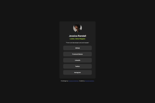
Responsive social link profile using HTML and CSS
@shanib-ibrahim

Solution retrospective
What are you most proud of, and what would you do differently next time?
I am slowly improving in CSS and HTML.Next time i will be focus more on grid, transition and animations.
What challenges did you encounter, and how did you overcome them?No challenges
What specific areas of your project would you like help with?CSS area only i need help. If anyone could help me with the review of the code it will be very helpful for me.
Code
Loading...
Please log in to post a comment
Log in with GitHubCommunity feedback
No feedback yet. Be the first to give feedback on Shanib Ibrahim's solution.
Join our Discord community
Join thousands of Frontend Mentor community members taking the challenges, sharing resources, helping each other, and chatting about all things front-end!
Join our Discord