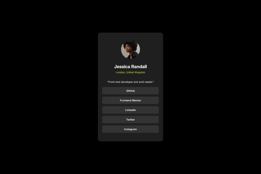
Design comparison
Solution retrospective
I am proud of to complete this project 3x faster than my previous 2 projects. I didn't face any problem coding layout and responsive model. It gave me much confidence.
What challenges did you encounter, and how did you overcome them?In absence of Figma Design file, it was tough for me to adjust the sizes of my containers.
What specific areas of your project would you like help with?I would like to have help about the more layout models like grid.
Community feedback
- @FranciscoDavidCampuzanoMelgarejoPosted 8 months ago
Pretty good. But, just like you used 'gap' on the container, you could have used 'gap' on the <div> of the personal information (more direct than using margin) and you could have done the same with the link list, that way the last element does not add margin.
Overall, all good
0@AamnbabaPosted 8 months agoThank you. I will try to do better. @FranciscoDavidCampuzanoMelgarejo
0
Please log in to post a comment
Log in with GitHubJoin our Discord community
Join thousands of Frontend Mentor community members taking the challenges, sharing resources, helping each other, and chatting about all things front-end!
Join our Discord
