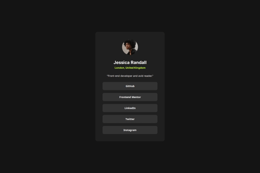
Responsive social link profile card with react and sass
Design comparison
Solution retrospective
I’m most proud of how I structured this project with Atomic Design principles. Using Sass for modular styles allowed me to handle custom properties effectively and build responsive, accessible components. Setting up Storybook helped tremendously with visualizing each component in isolation, which streamlined testing and ensured consistency across the app.
If I were to approach this differently, I’d experiment with more detailed animations and hover states to add subtle interactivity. I would also consider implementing a more advanced state management solution if the project complexity grew, such as integrating context or a library like Zustand for future extensibility.
What challenges did you encounter, and how did you overcome them?One challenge was ensuring accessibility throughout the project. I had to dig deeper into the appropriate use of ARIA attributes and focus states for keyboard navigation. To overcome this, I tested each interactive element with keyboard-only navigation and made adjustments where needed. Another challenge was organizing Sass variables and mixins in a way that kept the styling modular but still allowed reuse across components. Leveraging Sass’s @use and @mixin directives helped with this.
What specific areas of your project would you like help with?- Accessibility: I’d love feedback on my approach to accessibility, especially on handling ARIA roles and labels for components like buttons and sections. Are there any best practices or areas I could improve to make the interface even more accessible?
- Testing Strategy: I focused mainly on unit tests for the components. Any suggestions on incorporating end-to-end or accessibility tests, especially using tools like Cypress or Axe, would be helpful.
- Code Organization in Storybook: While I set up Storybook successfully, I’m curious about how to best organize components and their stories for larger projects. Any tips on handling more extensive component libraries with Storybook would be appreciated.
Community feedback
Please log in to post a comment
Log in with GitHubJoin our Discord community
Join thousands of Frontend Mentor community members taking the challenges, sharing resources, helping each other, and chatting about all things front-end!
Join our Discord
