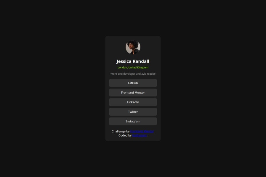
Design comparison
Solution retrospective
I am proud to see that I successfully produced a clean, aesthetically pleasing profile card. Its functionality is accompanied by the latest minimalist designs and incorporates modern minimalistic layout; the social links and the profile details are perfectly demonstrated within a responsive user-friendly design. Next time, it should be even more interactive, using slight animations or hover effects on various places to make it much more interesting for users. In fact, I would also consider making accessibility to some extent better by making proper ARIA labels as well as optimizing it for better working with screen readers for increased accessibility. Also, this would also be great, perhaps, by integrating back end support in order to ensure dynamic data retrieval thus developing a highly scalable profile card solution. In contemplating the thought of this project I would realize areas where my added creativity can expand future functionalities.
What challenges did you encounter, and how did you overcome them?The biggest problem I encountered was aligning elements correctly so the profile card layout would appear clean and remain responsive to all sizes of screens. It is difficult to keep everything in its place while still making sure there is sufficient spacing, so it ends up being polished on both mobile and desktop views. I used flexible layout techniques from CSS Flexbox along with media queries, making control over the layout even better than before, ultimately creating a more balanced view between devices.
Please log in to post a comment
Log in with GitHubCommunity feedback
- P@kisu-seo
This is a well-made piece of work. However, I believe it would be even better if it were aligned more closely with the design guide.
Marked as helpful
Join our Discord community
Join thousands of Frontend Mentor community members taking the challenges, sharing resources, helping each other, and chatting about all things front-end!
Join our Discord
