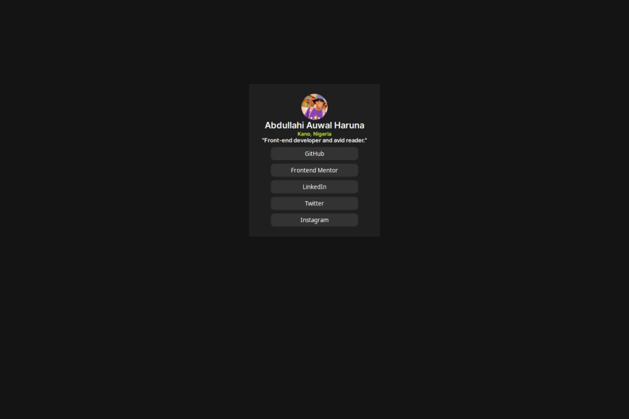
Design comparison
Solution retrospective
Trying to learn a new concept
What challenges did you encounter, and how did you overcome them?I know there is but i dont know how to specify
What specific areas of your project would you like help with?Flexbox
Community feedback
- @fayiz770Posted 10 months ago
Hello there 👋. Congratulations on successfully completing the challenge! 🎉
I have a suggestion regarding your code that I believe will greatly interest you.
HTML
Semantic Structure:
Your HTML structure is semantic and easy to understand. Using <main> for the main container and appropriate tags for headings and sections enhances readability and accessibility.
Meta Tags
The meta tags are well-set, ensuring proper character encoding and responsive design.
Comments
Including comments to denote sections like attribution (even though it's commented out) is good practice for clarity.
CSS Reset
The reset section at the top is a good practice to ensure consistent styling across different browsers.
Variables
Using CSS variables for colors is excellent for maintainability and consistency.
Custom Fonts
Properly embedding custom fonts is a nice touch, ensuring the design looks as intended across different environments.
Responsive Design
The overall design is responsive due to flexible units like percentages and viewport height (vh). However, you might want to add media queries for finer control over different screen sizes.
Styling:
The choice of colors and spacing is visually appealing. The dark theme with green accents provides a modern look.
Hover effects on buttons enhance the user experience by providing interactive feedback.
Flexbox
Using Flexbox for layout ensures that the elements are well-aligned and centered. This is a modern and efficient approach to CSS layout.
Improvements
Accessibility
Consider adding aria-labels or aria-labelled by attributes for better accessibility, especially on interactive elements like buttons. Ensure that text contrast meets accessibility standards for better readability.
Font Loading
Specify a font-display property for your custom fonts to control their behavior during loading.
Button Links
If the buttons are intended to be links to social profiles, use anchor tags (<a>) styled as buttons instead of <button> elements. This will improve semantics and accessibility.
Container Size
The fixed height (350px) of the main container might cause issues with different content sizes. Consider using min-height instead or adjusting height based on content.
Example of Accessible Button
<a href="https://github.com" class="social-button" aria-label="GitHub">GitHub</a>CSS for Anchor Styled as Button
  background-color: var(--Grey);
  color: var(--White);
  border-radius: 0.5rem;
  padding: 6px 0;
  display: block;
  text-align: center;
  text-decoration: none;
  margin-bottom: 8px;
}

.social-button:hover {
  background-color: var(--Green);
  color: var(--Off-Black);
  cursor: pointer;
}
Final Thoughts
Overall, your project is well-executed and shows a strong understanding of HTML and CSS fundamentals. Implementing the suggested improvements can further enhance its functionality and accessibility. Great job!
If you find this comment helpful mark this helpful. Thanks
Marked as helpful1 - @fayiz770Posted 10 months ago
Hello there 👋. Congratulations on successfully completing the challenge! 🎉
I have a suggestion regarding your code that I believe will greatly interest you.
HTML
Semantic Structure:
Your HTML structure is semantic and easy to understand. Using <main> for the main container and appropriate tags for headings and sections enhances readability and accessibility.
Meta Tags
The meta tags are well-set, ensuring proper character encoding and responsive design.
Comments
Including comments to denote sections like attribution (even though it's commented out) is good practice for clarity.
CSS Reset
The reset section at the top is a good practice to ensure consistent styling across different browsers.
Variables
Using CSS variables for colors is excellent for maintainability and consistency.
Custom Fonts
Properly embedding custom fonts is a nice touch, ensuring the design looks as intended across different environments.
Responsive Design
The overall design is responsive due to flexible units like percentages and viewport height (vh). However, you might want to add media queries for finer control over different screen sizes.
Styling:
The choice of colors and spacing is visually appealing. The dark theme with green accents provides a modern look.
Hover effects on buttons enhance the user experience by providing interactive feedback.
Flexbox
Using Flexbox for layout ensures that the elements are well-aligned and centered. This is a modern and efficient approach to CSS layout.
Improvements
Accessibility
Consider adding aria-labels or aria-labelled by attributes for better accessibility, especially on interactive elements like buttons. Ensure that text contrast meets accessibility standards for better readability.
Font Loading
Specify a font-display property for your custom fonts to control their behavior during loading.
Button Links
If the buttons are intended to be links to social profiles, use anchor tags (<a>) styled as buttons instead of <button> elements. This will improve semantics and accessibility.
Container Size
The fixed height (350px) of the main container might cause issues with different content sizes. Consider using min-height instead or adjusting height based on content.
Example of Accessible Button
<a href="https://github.com" class="social-button" aria-label="GitHub">GitHub</a>CSS for Anchor Styled as Button
  background-color: var(--Grey);
  color: var(--White);
  border-radius: 0.5rem;
  padding: 6px 0;
  display: block;
  text-align: center;
  text-decoration: none;
  margin-bottom: 8px;
}

.social-button:hover {
  background-color: var(--Green);
  color: var(--Off-Black);
  cursor: pointer;
}
Final Thoughts
Overall, your project is well-executed and shows a strong understanding of HTML and CSS fundamentals. Implementing the suggested improvements can further enhance its functionality and accessibility. Great job!
If you find this comment helpful mark this helpful. Thanks
Marked as helpful1
Please log in to post a comment
Log in with GitHubJoin our Discord community
Join thousands of Frontend Mentor community members taking the challenges, sharing resources, helping each other, and chatting about all things front-end!
Join our Discord
