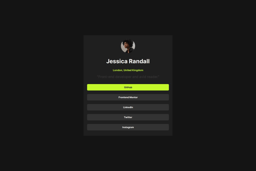
Design comparison
SolutionDesign
Solution retrospective
What specific areas of your project would you like help with?
a aaaa i want heelp with this javascript and design
Please log in to post a comment
Log in with GitHubCommunity feedback
- @yaywonah
- I would add a
border-radius: 15pxproperty to the .out-card div to round the corners like in the solution. - change the color of the .header-card .job CSS to
color: var(--White); - decrease the width of the .out-card div under
@media (min-width: 1200px)so that it's not as wide when on desktop - decrease the font size of the <h1> title
Marked as helpful - I would add a
Join our Discord community
Join thousands of Frontend Mentor community members taking the challenges, sharing resources, helping each other, and chatting about all things front-end!
Join our Discord
