

Design comparison

Solution retrospective
I am easily learn html, css, bootstrap but through practical i got some errors and new ideas but i solve errors through research in research i got new stuffs.So this is i proud of and next i improve my speed , thinking , etc..
What challenges did you encounter, and how did you overcome them?I encounter challenges with margin , padding and center a div etc.I overcome through varies research i am really happy when i overcome my challenges
What specific areas of your project would you like help with?the specific area is center the card and align the social media link boxes.
Please log in to post a comment
Log in with GitHubCommunity feedback
- @Basselfathy
Hi @Sakthi, great work on completing your first project! 👏
I noticed you're using Bootstrap for the layout—good choice! However, I believe the code can be streamlined a bit for simplicity. Here’s a suggestion:
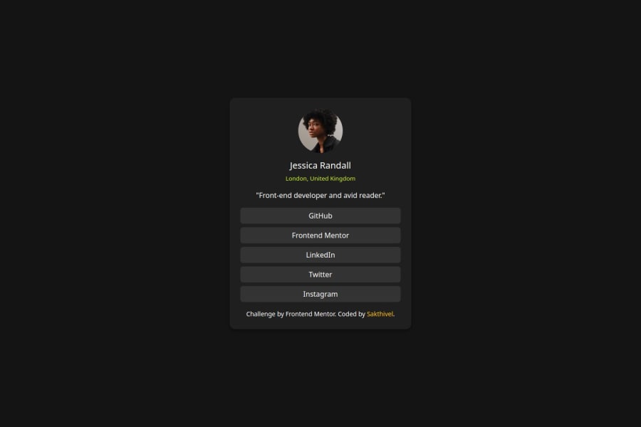
<div class="m-auto d-flex align-items-center vh-100" style="max-width: 25rem">
	<div class="card text-center w-100 p-4">
		<img src="images/avatar-jessica.jpeg" alt="Profile Photo" />
		<h5 class="mt-3 mb-0">Jessica Randall</h5>
		<p class="mt-2 text">London, United Kingdom</p>
		<p class="mb-3">"Front-end developer and avid reader."</p>
		<div class="d-flex flex-column" style="gap: 1rem">
			<a href="#" class="btn">GitHub</a>
			<a href="#" class="btn">Frontend Mentor</a>
			<a href="#" class="btn">LinkedIn</a>
			<a href="#" class="btn">Twitter</a>
			<a href="#" class="btn">Instagram</a>
		</div>
	</div>
</div>
Give it a try and compare the results to understand the differences and the reasoning behind these changes. Let me know how it works out! 😊

Join our Discord community
Join thousands of Frontend Mentor community members taking the challenges, sharing resources, helping each other, and chatting about all things front-end!
Join our Discord