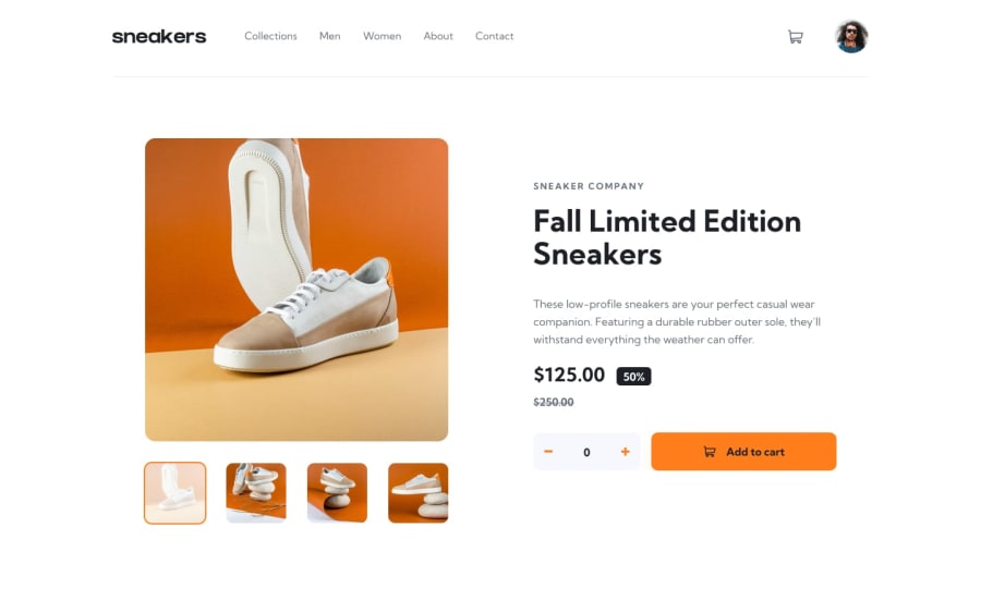
Design comparison
SolutionDesign
Solution retrospective
Hello, this is my solution to the challenge, for now I felt the need to refactor the code to reduce the repetitions and reuse the functions. I accept suggestions!
Community feedback
- @AhmadYousif89Posted over 1 year ago
Hi Adrial 👋
Your application looks great, especially on desktop (not so much on mobile), and I just want to share with you my thoughts and hope it is of use to you.
- users don't get any feedback after adding an item to the cart, especially if the count is 1
- if the count is 1 the counter on the cart icon doesn't get updated but the item gets added as intended.
- I would set the initial count to be 0 and then let the user increment it by themselves because now if I add the product 2 times for example the counter resets to 1 but if I clicked on "add to cart" again it doesn't take this value as the new qty of the item in the cart (as if it was 0 not 1🤔) so this logic needs refactoring IMO.
issues on the mobile view
- I can open the lightbox if I clicked on the big arrows (I would decrease the size a bit tho) and I don't know if this is intended behavior or not but the weird thing is that this happens only on initial reload of the page but if I scroll a bit it doesn't trigger the action again which is very weird.
- the side menu is not covering the full screen therefore I can see the bottom of the page if I scroll down (possible fix could be setting the backdrop overlay and the menu container with position fixed rather than absolute).
but overall the solution looks great 👍
Keep Coding 👊
0
Please log in to post a comment
Log in with GitHubJoin our Discord community
Join thousands of Frontend Mentor community members taking the challenges, sharing resources, helping each other, and chatting about all things front-end!
Join our Discord
