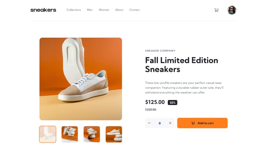
Responsive Sneaker Shopping Web App with React and scss
Design comparison
Solution retrospective
i am open to any form of criticism and would love to improve any way i can
Community feedback
- @besttlookkPosted over 2 years ago
Following issues i found : 1.fonts are too small for both small and larger screen. 2. Gap between cart-icon and avatar is quite large. 3. Size of lightbox slider is too small. and size od slider on page is large.
overall its good.
here is my take.. https://e-commerce-product-page-fem.herokuapp.com/
feel free to give your opinion
good luck
Marked as helpful1@ejim11Posted over 2 years ago@besttlookk for yours, probably heroku messed with it’s responsiveness so it’s kind of mixed up in tab view. Also the dots for the gallery are one sided instead of being centered
It’s nice tho and very bold 🤛🏽
0@ejim11Posted over 2 years ago@besttlookk thank you very much ranjan. i have made the apt corrections. l
1
Please log in to post a comment
Log in with GitHubJoin our Discord community
Join thousands of Frontend Mentor community members taking the challenges, sharing resources, helping each other, and chatting about all things front-end!
Join our Discord
