E-Learning Landing Page (SCSS)

Solution retrospective
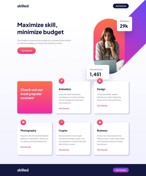
I am happy that my solution is quite similar to the designed one. I was trying to make my code clean but I would write my media quaries in one place next time.
What challenges did you encounter, and how did you overcome them?The most difficult for me was overcome the hero image especially its position. After a lot of tries, I have decided to use max-width on the image combined with absolute position and negative fixed pixels in top and right properties.
I also realised that i need to be tricky to create hover effect on buttons with linear gradient background. I used psuedo elements with white background and opacity.
What specific areas of your project would you like help with?Every comment will be helpful. Let me know what do you think about my hero image approach. How would you overcome this? 🤔
Please log in to post a comment
Log in with GitHubCommunity feedback
No feedback yet. Be the first to give feedback on Bartosz Dudziak's solution.
Join our Discord community
Join thousands of Frontend Mentor community members taking the challenges, sharing resources, helping each other, and chatting about all things front-end!
Join our Discord