responsive site using Vue.js and Tailwind

Solution retrospective
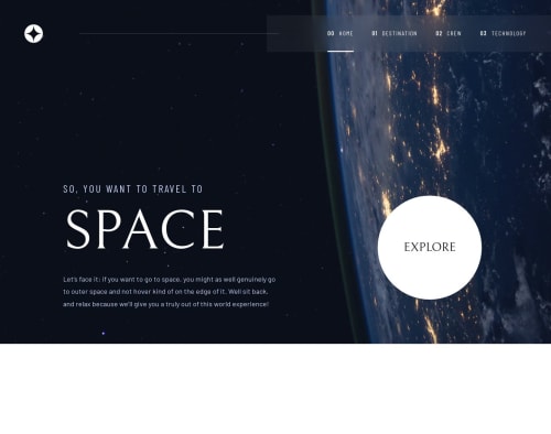
I'm proud of the responsive header. Next time, I think I will define fonts in the CSS index at the beginning of the project. I started using Tailwind config, but it's not the best way for responsive text.
What challenges did you encounter, and how did you overcome them?My biggest difficulty was using Vue, as this is my first complete project with it. On the other hand, this project allowed me to improve my CSS knowledge. I discovered some properties that I had never had the occasion to use before.
What specific areas of your project would you like help with?I'm not sure if my management of the "selected destination" is the best ; perhaps it would have been better to handle it through the URL. What do you think ?
Please log in to post a comment
Log in with GitHubCommunity feedback
No feedback yet. Be the first to give feedback on Nelly's solution.
Join our Discord community
Join thousands of Frontend Mentor community members taking the challenges, sharing resources, helping each other, and chatting about all things front-end!
Join our Discord