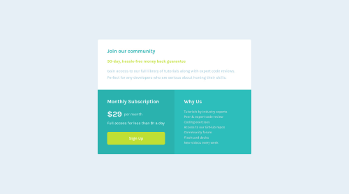
Design comparison
Solution retrospective
Feel free to take a look at my code.
Community feedback
- @afrusselPosted over 3 years ago
Great 👍work. Almost close to design. Wow.
Happy coding 🙂
3 - @AngusDSRPosted over 3 years ago
Looks great, well done!
I came here to see how you had decided to use semantics and see you've used main and article elements - is this pretty standard? Thanks.
0@zyq-mPosted over 3 years ago@Cowfresh actually im not pretty sure to use semantics tag😅 But it make sense right.
1@AngusDSRPosted over 3 years ago@zyq-m it's pretty clear until you make something like this or with cards, right?! :D
I decided to use a header for the top and then sections in the end.
I refer to this page for reference: https://developer.mozilla.org/en-US/docs/Web/HTML/Element#content_sectioning
Marked as helpful0@zyq-mPosted over 3 years ago@Cowfresh That's a creative way though!! Thank you for the reference.
0
Please log in to post a comment
Log in with GitHubJoin our Discord community
Join thousands of Frontend Mentor community members taking the challenges, sharing resources, helping each other, and chatting about all things front-end!
Join our Discord