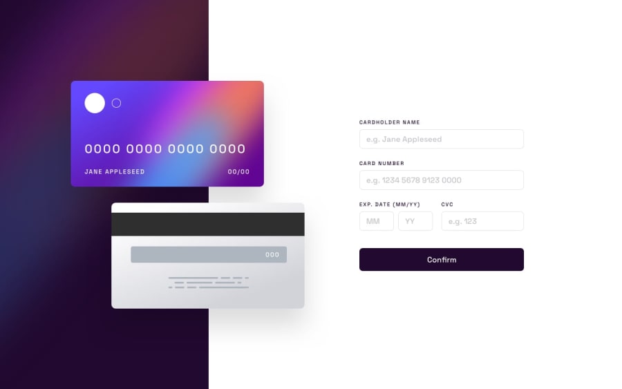
Design comparison
Solution retrospective
The only challenging thing about this project was making the site responsive. I think that might be my weakness when it comes to front-end web development. One thing I want to learn is HTML landmark tags. All I know is that it aids in accessibility, but I'm not sure about SEO.
I hope I didn't break the design from widths 933-1260px, The site looked weird, so I adjusted the positioning of the cards to give additional space to the form and thank you status.
My biggest curiosity throughout this project is how exactly do websites & applications process payments? do they use some sort of api, does the api support multiple regions? How would this be handled on the back-end? I've been wondering for some time now.
Thanks for checking this out.
Community feedback
Please log in to post a comment
Log in with GitHubJoin our Discord community
Join thousands of Frontend Mentor community members taking the challenges, sharing resources, helping each other, and chatting about all things front-end!
Join our Discord
