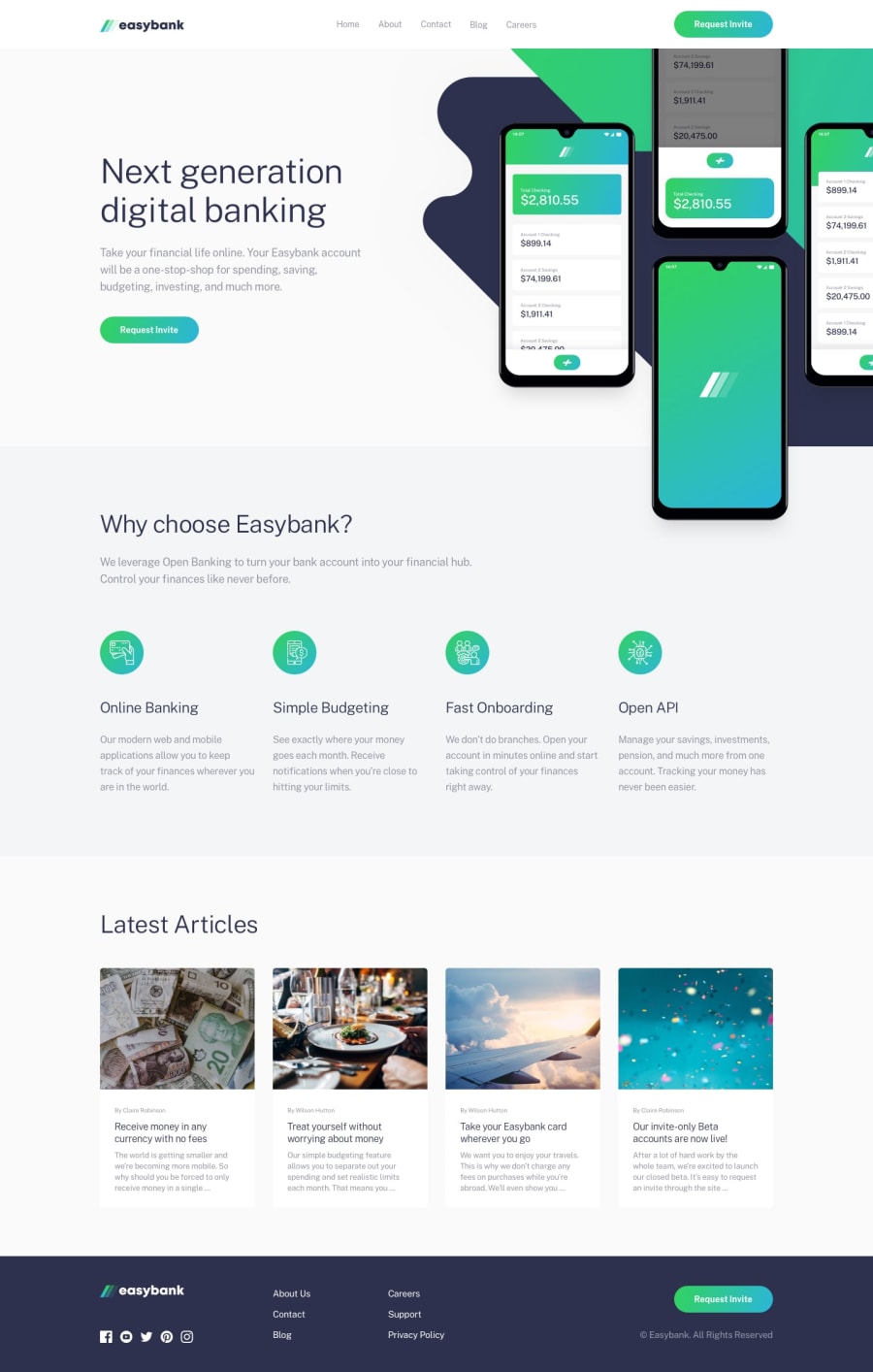
Design comparison
Solution retrospective
I tried to make it Responsive as much as possible. Your feedback helps me in improvement. Please give me some suggestions on how can I make the hero image completely responsive. I made that layout of hero image with clip-path and added scroll animations using aos.js library
Community feedback
- @pikapikamartPosted about 3 years ago
Hey, awesome work on this one. The layout in desktop looks great, the responsiveness could be better because there are some section when you resize the screen's width, the elements are being squished, buttons are almost overlapping other contents. However, the mobile layout looks really great.
The animation are great as well, but I prefer when the image is now visible, the element stays at that and won't animate again, once is enough:>
Some other suggestions would be that:
- No need to set
max-width: 100%on thebodytag since it will use 100% at default still. - Use a
headerfor the topmost part. A typical layout structure looks like:
<header />
<main />
<footer />
By doing this, you are making the elements that has content be inside a landmark element. This helps users to properly navigate your site.
- The website-logo should be outside the
navsince it is not one of your navigational links. - The
altfor the website-logo should bealt="easybank", website-logo should always be meaningful. Also, when usingaltavoid adding words that relates to "graphic" such as "logo, icon,image..."imgis already a graphic so no need to describe it as one. request invitebuttonlacks a visual indicator. If you remove theoutlineproperty to an element, make sure to add an indicator on the element's:focus-visiblestate so that users will know where they are at when navigating your site.- The hero-section image needs a more meaningful
altvalue than justhero-image. If the image is meaningful, describe the image. - Avoid using multiple
h1on a page. Use only at least 1h1per page. - Each icon on the second section should be hidden since they are just decorations. Use
alt=""on it and add an extraaria-hidden="true"attribute on theimgtag so that it will be invisible for all users. - When using heading tag, make sure you are not skipping a level. If you use
h3make sure thath1, h2are present before it. altvalues for each of the articleimgcould be left empty or maybe use a more meaningfulalt?- Since those are articles right, it would be great to use
articletag to wrap the content. Then the heading text of each article should be a link so useatag on them. Since on a real site, those will be a link for individual article. Also the name of the person for each article could be a heading tag.
FOOTER
- Website logo should use
alt="loopstudios"as well. - Those social media could be inside a
ulelement since those are "list" of social media. - Each social media should be inside a
atag since those are supposed links. Eachatag should either usearia-labelattribute or ansr-onlyelement inside it. The value for whatever method you will use should be the name of the social media like:
<a href="facebook.com" aria-label="facebook">
  img inside
</a>
This way user will know where this link would take them. But the
sr-onlymethod is the preferred one, you can search that one up to know howsr-onlyworks.- Each social media
imgshould be hidden since they are just decoration, use thealt=""andaria-hidden="true"attribute on them. - The 6 links could have been wrapped inside a
navelement, since those are still your websites' navigational links. Also, you don't separate each 3 links, they should be inside a singleulelement since they are related, a 1 whole navlinks.
MOBILE
- Hamburger menu should be using
buttonand notimg. An interactive component needs to use an interactive element, always.imgalone is not accessible for this kind of t component.
SUPPOSING BUTTON IS USED
- The
buttonshould have again eitheraria-labelattribute orsr-onlyelement inside it. The value will describe what does thebuttondo. A sample value would be "navigation dropdown menu". - The
buttonneeds to usearia-expanded="false"as an default attribute on it. It will be changed by js totrueif the user toggles thebutton. - Make the font-sizes for the text large on the mobile state, right now they are very small. Adjust it.
- Lastly, work more on the responsive state on this one. Before submitting, always inspect your layout in dev tools, check whether the layout is looking good at different screen size.
Aside from those, great work again on this one.
Marked as helpful1@prabhkaur301Posted about 3 years ago@pikamart Thank you so much for such a knowledgeable feedback. It helps in understanding these concepts and their importance in web development. I am working on the improvement of this project.
1 - No need to set
Please log in to post a comment
Log in with GitHubJoin our Discord community
Join thousands of Frontend Mentor community members taking the challenges, sharing resources, helping each other, and chatting about all things front-end!
Join our Discord
