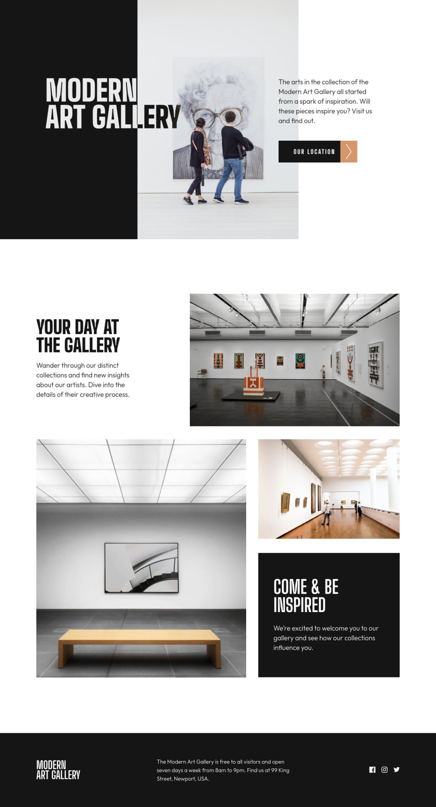
Design comparison
SolutionDesign
Solution retrospective
This was a bit challenging. Any comments are much appreciated.
Community feedback
- Account deleted
Hi there 👋
Your design looks beautiful 😃.
One little thing compared to design is different 🤔. Let's change the
align-itemstoflex-startin.footer .containerin your CSS. With this your project looks 💯 same to original designGood luck 🍀
Marked as helpful0
Please log in to post a comment
Log in with GitHubJoin our Discord community
Join thousands of Frontend Mentor community members taking the challenges, sharing resources, helping each other, and chatting about all things front-end!
Join our Discord
