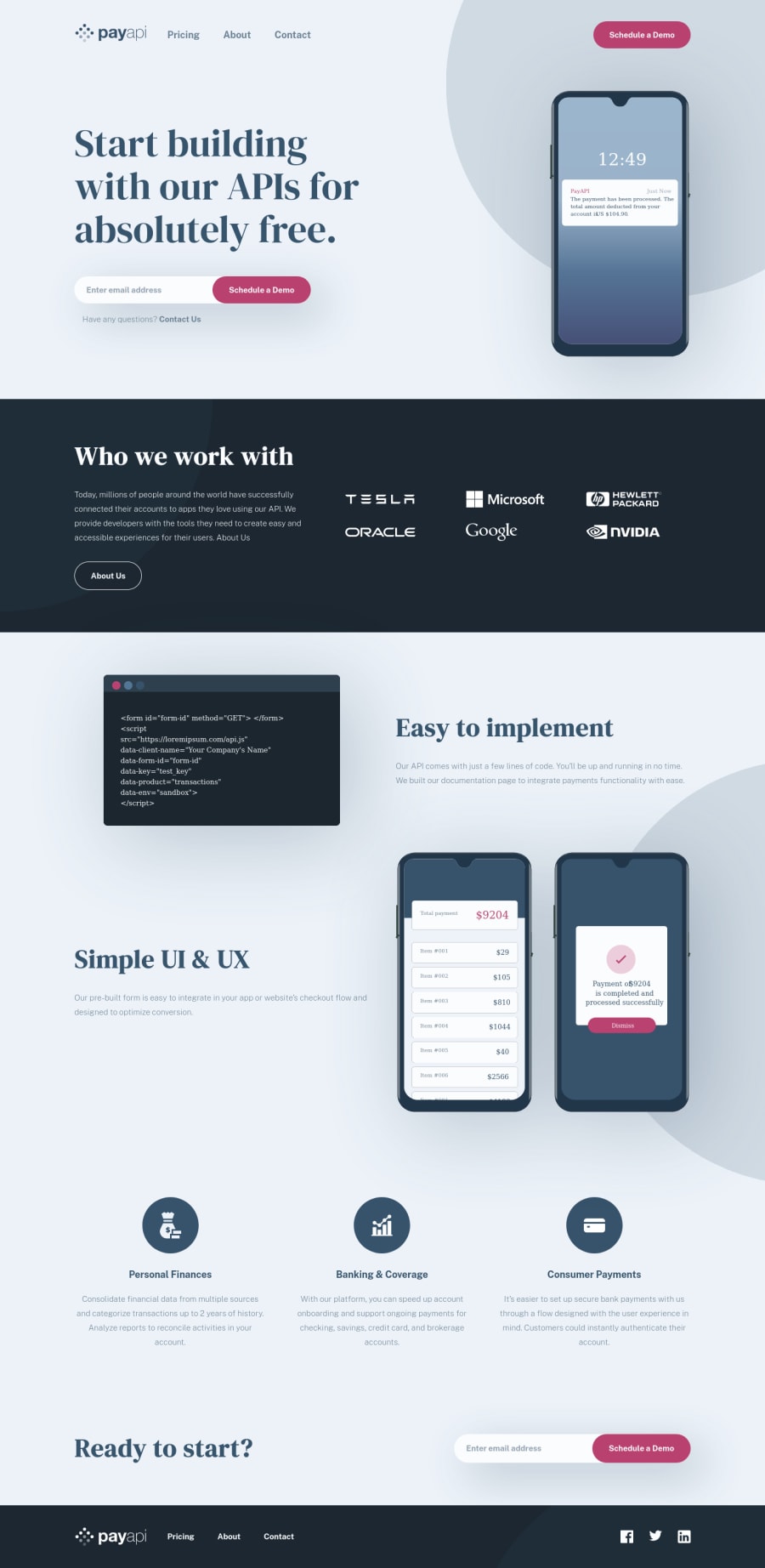
Design comparison
Solution retrospective
I had some challenge placing the circles. I think I've worked it out the way I have done it but if anyone has other suggestions I would welcome them.
Community feedback
- @helphopPosted almost 4 years ago
Excellent. I will do as you suggest. Thanks again.
1 - @helphopPosted almost 4 years ago
Hey Matt,
Thank you very much for your awesome feedback. I really appreciate you taking the time to have a look at the site and reflect on some ways I can improve. I agree I have to bite the bullet and do some client side validations using JS. I have been focusing more on improving my css skills so I kinda punted that the JS work.
I have a question about feedback. I have not received much feedback from the community about my work so far. This is in fact the first time I am receiving feedback and I really appreciate it. What I would like even more and would be willing to pay for is to go over my work with someone on your team to discuss other ways to improve my code so that I can really push the usefulness of these exercises and get the most out of them.
Does FrontendMentor provide any services like this?
Best, Mitch
0@mattstuddertPosted almost 4 years ago@helphop you're welcome! We don't have any services like that I'm afraid. There's a chance it could be something we add down the line, but not for the foreseeable future.
The best way to give yourself a good chance of getting valuable feedback is to ask specific questions when you post your solution. The more specific and detailed you can be about the type of feedback you'd like, the higher the chance will be that someone will give you feedback.
Writing detailed questions makes it easier for others to help you. This is an area I'm looking to improve on the platform itself as well. It's not very clear that you'll be more likely to get feedback if you ask detailed questions. I'll also be working on a number of updates on the platform to make this more obvious and make it easier for others to give valuable feedback.
When you submit your next solution I'd recommend taking some time to think about the areas where you'd like specific feedback. Hopefully, that will then lead to more feedback from others 🙂
0 - @mattstuddertPosted almost 4 years ago
Awesome work on this challenge, Mitchell. Nice to see you diving in at the deep end with such a big project as your first challenge! Did you learn anything new while working through it?
After looking at your project, here are some pointers:
- I'd recommend reviewing the solution report and try resolving those issues
- Your forms currently don't have any client-side validation. I'd recommend trying to implement this using the active state designs as a reference. Form validation is a common development task, so it's definitely worth practising
- You've set the
alt
text for the logo to the word "logo". This doesn't help describe the image for screen reader users. As it's a logo image, the name of the company/site would be best. So you could update that to say "Pay API".
It's great to see you using the
picture
element for responsive imagery. The general responsiveness of your layouts looks good too and it's great to see you usingmin-width
media queries.I hope that helps. Keep up the great work! 👍
0
Please log in to post a comment
Log in with GitHubJoin our Discord community
Join thousands of Frontend Mentor community members taking the challenges, sharing resources, helping each other, and chatting about all things front-end!
Join our Discord