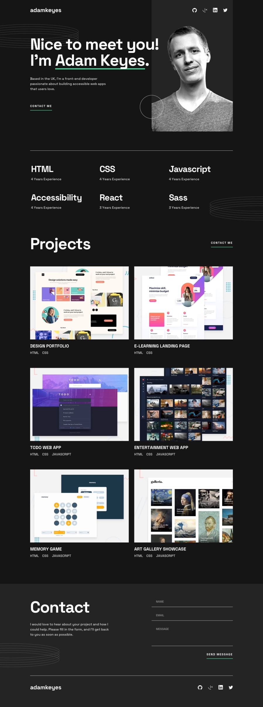
Design comparison
Solution retrospective
Feedback is welcome.
Community feedback
- @K01wfdPosted about 1 year ago
Hi @seamissu, my suggestions for your solution:
-
In your page structure i have noticed you are using section, div element outside of a landmark element, which will make the page difficulte for assestive technologies, wrapping all the main content inside main element would be better.
-
the social icon does not change the fill color on hover state, one way to change an svg fill color dynamically is to use svg sprites file that holds all the social svg's content then throw css var() in fill property and then in your css codes just specify where the variable should get a new value for example: in your svg
fill="var(--fill-color, #fff)"then in css.social-icon:hover{--fill-color:green;}. -
In the projects section, the vertical spacing between the projects it's bit too small.
0@seamissuPosted about 1 year ago@Korg01wfd Really appreciate your detailed suggestions. I've fixed all of these issues > _ <
0 -
Please log in to post a comment
Log in with GitHubJoin our Discord community
Join thousands of Frontend Mentor community members taking the challenges, sharing resources, helping each other, and chatting about all things front-end!
Join our Discord
