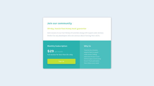
Design comparison
Solution retrospective
Any feedback positive & negative is welcome.
Third project - Attempting to use what I've learned so far as early as possible (feels like best suited for my learning) so any feedback is most welcome.
Community feedback
- Account deleted
Hi AREXHEPI1. Congrats on completing this challenge. 🥳🎉
Here some tips to improve your code. 🚀
HTML: 🧱
If you can see in the reports that Frontend Mentor gives you, it mentions that your page must contain a level one header <h1>. Avoid omitting header levels, you should start with the header
<h1>
and successively with<h2> ... <h6>
.More info here
CSS: 🎨
Your reset is good 🙃, but you can improve it by using some popular resets like the following 🚀:
Your solution is very good! 💯🚀
Happy coding! ✌️🙃
Marked as helpful0@ARexhepi1Posted almost 2 years agoThank you @FLCHRIS. Will remember to start with <h1>, can I ask is best practice to use only one <h1> in HTML?
re: resets - I have used Josh Comeau's resets in one of the earlier projects but felt like my css grew way too large. I guess I should focus more on the actual css than the reset to keep the code to a minimum.
Again, thank you very much for your comment. Much appreciated.
0
Please log in to post a comment
Log in with GitHubJoin our Discord community
Join thousands of Frontend Mentor community members taking the challenges, sharing resources, helping each other, and chatting about all things front-end!
Join our Discord