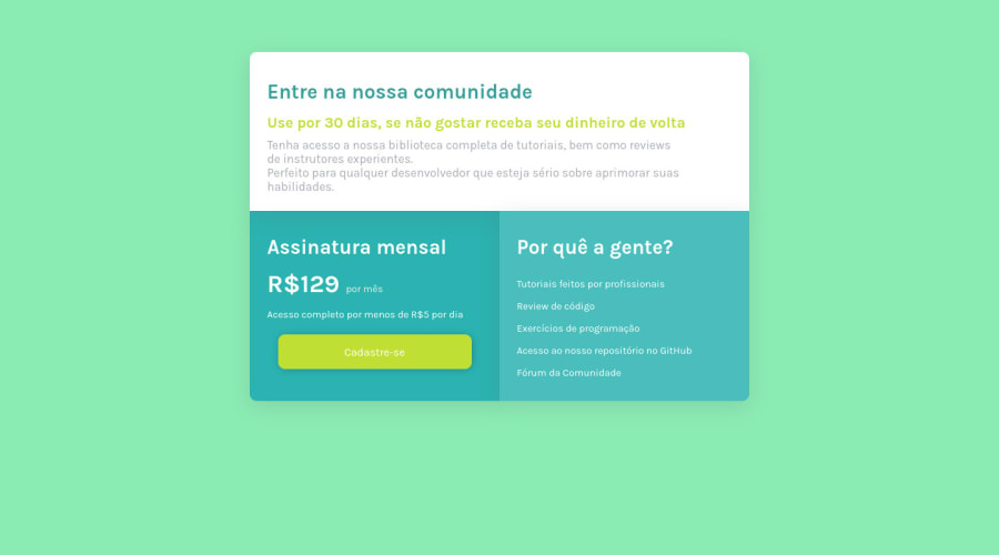
Responsive Single Price Grid using HTML and CSS
Design comparison
Solution retrospective
It was difficult at first to do the responsive part of the project, I believe it's not perfect as it is, but I'm very proud with the results.
Community feedback
- @correlucasPosted about 2 years ago
👾Oi Lucas Ferreira, tudo bem? Parabéns pelo desafio!
Acabei de ver sua solução e tenho umas dicas pra melhorar seu código/design:
A sua solução está mto boa, mas eu queria te deixar umas dicas pra você alinhar ele usando
flexboxque é o método mais fácil de todos.A primeira coisa que você tem que fazer é adicionar algumas propriedades pro body, primeiro adicionamos
display: flexeflex-direction: columnpra alinhar tudo na vertical. Depois adicionemin-height: 100vh(isso vai fazer com que o body tenha 100% da tela como tamanho) e com isso o elemento filho (no caso o container) vai se alinhar ao tamanho dele, no caso 100% da tela, dessa forma ele ficará centralizado, entendeu?body { display: flex; font-family: 'Karla', sans-serif; background-color: rgb(139, 236, 179); background-size: cover; min-height: 100vh; flex-direction: column; justify-content: center; }👋 Espero ter ajudado e continue no foco!
Marked as helpful1@lucasjantaPosted about 2 years ago@correlucas opa, muito obrigado pelas dicas, muito legal ver um conterrâneo por aqui hahahaha
0 - @denieldenPosted about 2 years ago
Hi Lucas, congratulations on completing the challenge, great job! 😁
Some little tips for optimizing your code:
- add
maintag and wrap the card for improve the Accessibility - use
pelementfor the text of card and not ah3 - remove
margin-topfromsectiontag - use flexbox to the body to center the card. Read here -> best flex guide
- after, add
min-height: 100vhto body because Flexbox aligns child items to the size of the parent container - instead of using
px or %use relative units of measurement likerem-> read here - not use
vwunits for the font size bur userem
Hope this help! Happy coding 😉
Marked as helpful1@lucasjantaPosted about 2 years ago@denielden thanks for your tips, I will take a look ;)
0 - add
- @hyrongennikePosted about 2 years ago
Hi @lucasjanta,
Nice job on your first attempt of the challenge
Just small improvement. You can center the card by replacing the your body rule with the following.
body {
    font-family: 'Karla', sans-serif;
    background-color: rgb(139, 236, 179);
    background-size: cover;
    display: flex;
    flex-direction: column;
    justify-content: center;
    min-height: 100vh;
}

section {
   margin: 0;
}
Also use instead of using vw units for your fonts use rem, em or px. vw scales according to the viewport that's why the text is smaller on mobile devices.
Hope this helpful.
1@lucasjantaPosted about 2 years ago@hyrongennike thanks for commenting, I really appreciate it since I'm starting, I used the vw unit so it would change the size when I'm in a smaller or bigger screen, but I guess rem or em is better, thx :)
0@hyrongennikePosted about 2 years ago@lucasjanta completely understand you'll have to use media queries because the values on desktop will be small on mobile.
1
Please log in to post a comment
Log in with GitHubJoin our Discord community
Join thousands of Frontend Mentor community members taking the challenges, sharing resources, helping each other, and chatting about all things front-end!
Join our Discord
