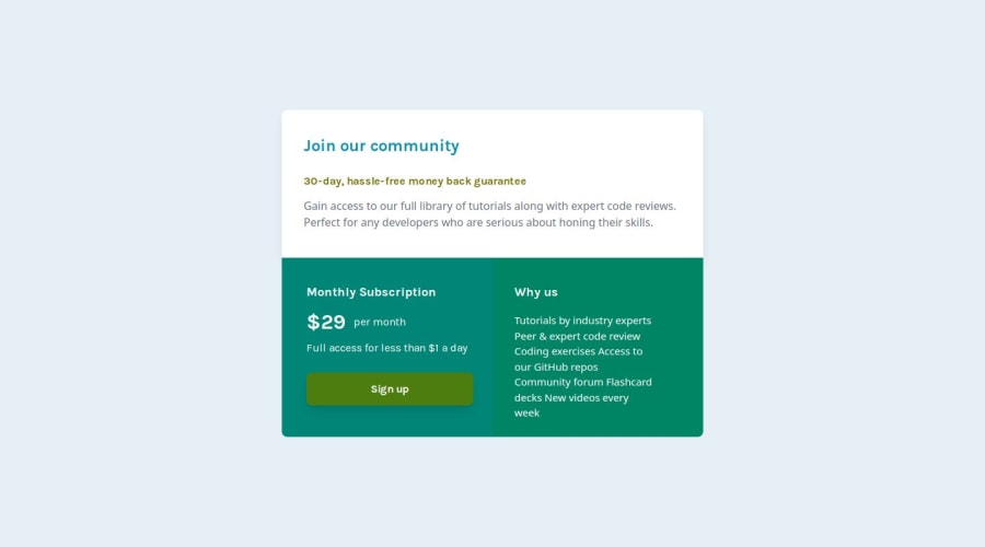
Responsive single price grid component using grid property
Design comparison
Solution retrospective
Hi Front-End Mentor Community🙋♂️
This is my solution for this challenge, go check it out🧑🎓
🎮Features
- Focused on Responsive layout with mobile first approach.📲
- Achieved 100% in performance, accessibility, Best practices and SEO in lighthouse testing
- Developed with Next.js for optimized performance and enhanced user experience.🚀
- Utilized Framer Motion transition effect in button for seamless delightful interactions.💫
- Codebase is well maintained and formatted using Prettier.💻
- Integrated ESLint for code quality assurance and maintainability.🛠️
- Implemented autoprefixer for seamless CSS compatibility across different browsers, ensuring a consistent user experience.🌐
🛠️Built With
- HTML5📃
- TailwindCSS 🎨
- React.js👾
- Next.js 14.1.0🔺
- TypeScript🤖
- TSX📜
- Framer-motion🎭
Amazing, project for beginner who want to enhance their skill in html & CSS. I recommend to learn grid and implement in this challenge. Basically I did not prefer to use flex in this because in this challenge you can complete it by grid much better and responsive as compare to using flex. ALso, updated favicon icon in this project.
At Last don't forget to give feedback, your feedback is crucial for our improvement! Help us make this project even better by sharing your thoughts. Thank you!💓
Community feedback
Please log in to post a comment
Log in with GitHubJoin our Discord community
Join thousands of Frontend Mentor community members taking the challenges, sharing resources, helping each other, and chatting about all things front-end!
Join our Discord
