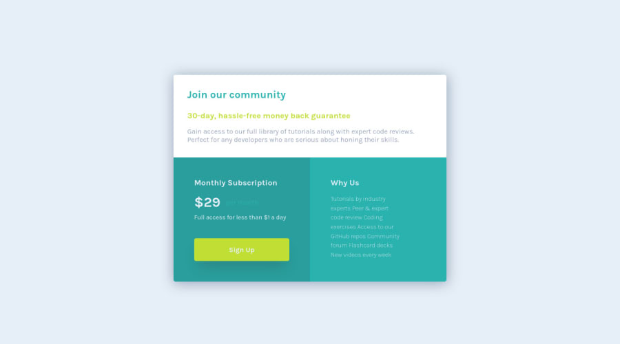
Responsive Single price grid component using css grid and flexbox
Design comparison
Solution retrospective
Though I was able to achieve the desired result, I'm not sure if I am following the best practices. Any help, criticism or feedback is welcome, I am here to learn!
Community feedback
- @VCaramesPosted over 2 years ago
Hey there! 👋 Here are some suggestions to help improve your code:
-
The purpose of the Main Element is to identify the main content off your page; It is not the container of you component. Inside the Main Element, you will want to create a new container and place your component inside that new container.
-
The “30-day, hassle-free money back guarantee” is not a heading. It should instead be wrapped in a Paragraph Element.
-
The “Why Us” list needs to be created using an Unordered List Element along with the List Items Element.
If you have any questions or need further clarification, feel free to reach out to me.
Happy Coding! 🍂🦃
0 -
Please log in to post a comment
Log in with GitHubJoin our Discord community
Join thousands of Frontend Mentor community members taking the challenges, sharing resources, helping each other, and chatting about all things front-end!
Join our Discord
