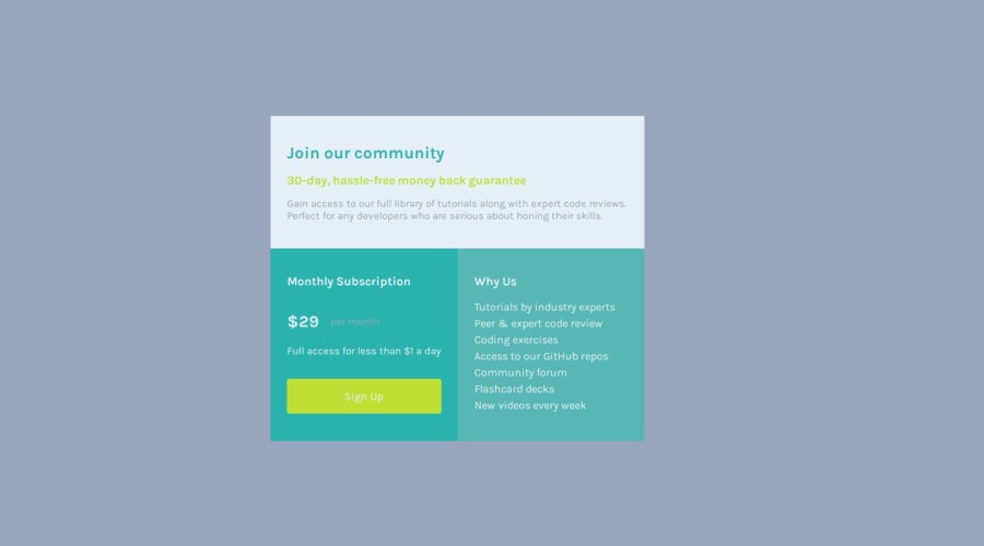
Responsive Single price Grid Component Master Using HTML & CSS


Design comparison

Solution retrospective
GOD DID. Please review my work cos i kind of feel like i couldve done better
What challenges did you encounter, and how did you overcome them?media querries. practice
What specific areas of your project would you like help with?RWD
Community feedback
- @dylan-dot-cPosted 4 months ago
Hey well done! This is a good solution!
One way you can make it better is to not use scaleable widths on elements(% or vw/vh) as it will different based on the screen size. Also be careful when doing it on child elements...
A good way to make sure things flow naturally is put a max-width on the
containerelement say500pxthen you can use grid/flex to center the elements.With that you dont need to add explicit width to the child elements like
.headand.wrapperas you would let flex/grid control that.I think if you just used
gridfor the whole card, it could be easier as you can use a 2x2 grid on desktop version and 1*3 grid on mobile.ALso dont have fixed
100vhon mobile, just make it min-height as on some mobile devices it won't really show the full content as some might be cropped off.0

Please log in to post a comment
Log in with GitHub
Join our Discord community
Join thousands of Frontend Mentor community members taking the challenges, sharing resources, helping each other, and chatting about all things front-end!
Join our Discord