Submitted 7 months ago
Responsive Single Price Grid Component Challenge Solution
@letsGetToCode
Design comparison
SolutionDesign
Solution retrospective
What are you most proud of, and what would you do differently next time?
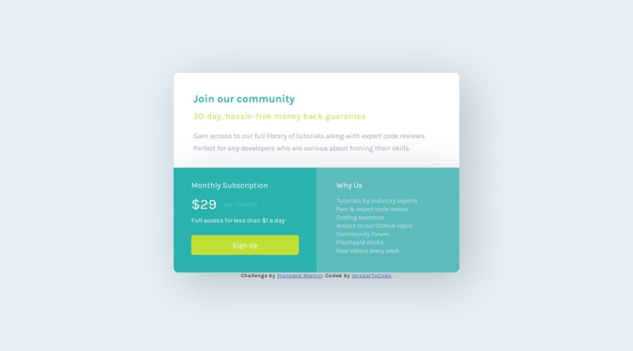
I am kind of proud of the result in this challenge. This was the first time I tried to make a responsive design.
I feel more comfortable using flexbox than grid. Next time I'll try css grid.
What specific areas of your project would you like help with?I tend to struggle to understand what in the design I should use and what I should create myself. For exemple there is only one cyan color(hsl(179, 62%, 43%)) in the design sheet, but there are two tones in the page.
I tested the cyan colors until I came up with one that looked right, but I this dosn't seems the best way to do it. Any advice?
Community feedback
Please log in to post a comment
Log in with GitHubJoin our Discord community
Join thousands of Frontend Mentor community members taking the challenges, sharing resources, helping each other, and chatting about all things front-end!
Join our Discord
