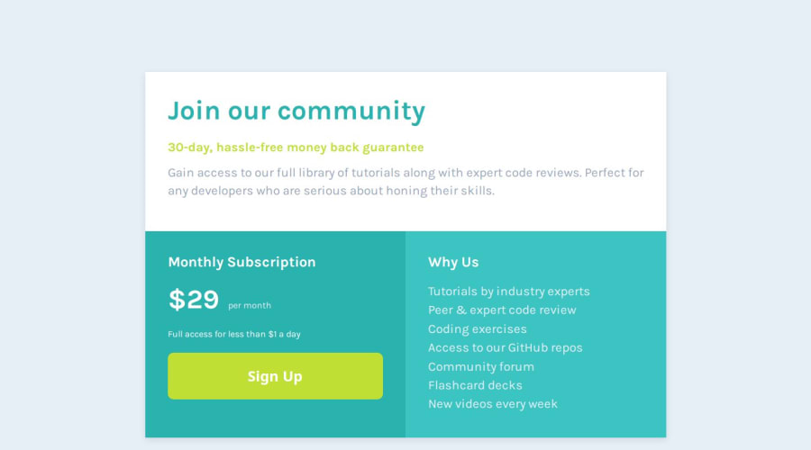
Design comparison
Solution retrospective
I recently implemented a mobile-first design approach for the first time in my code. I'm unsure about its quality and effectiveness, so I'd appreciate your professional feedback on it.
What challenges did you encounter, and how did you overcome them?As this was my first attempt at mobile-first design, I found it somewhat challenging, but I managed to complete it regardless.
What specific areas of your project would you like help with?I welcome any kind of feedback.
Community feedback
- @StroudyPosted 2 months ago
Hey, Thanks for reaching out, Fantastic effort on this! You’re really nailing it. Just a few things I noticed that could make it even better…
- Here
--fs-font-size: 16px;You should change this toremto be consistent, - From previous feedback I did suggest you download and host your own fonts, Looks like that was not implemented into the solution,
- I also mentioned about a CSS naming convention, BEM (Block, Element, Modifier), You should check that out for easy CSS naming,
- Using
remoremunits in@mediaqueries is better thanpxbecause they are relative units that adapt to user settings, like their preferred font size. This makes your design more responsive and accessible, ensuring it looks good on different devices and respects user preferences.@media (min-width: 1200px) - Here Line-height should be unitless,
.upper-wrapper .gain-access { white-space: pre-line; /* for new line */ line-height: 2rem; }- You should start using a full modern CSS reset is beneficial because it removes default browser styling, creating a consistent starting point for your design across all browsers. It helps avoid unexpected layout issues and makes your styles more predictable, ensuring a uniform appearance on different devices and platforms, check out this site for a Full modern reset -This is a small reset, Nothing wrong with it but it does not reset all browser default settings,
* { box-sizing: border-box; margin: 0; padding: 0; }-
This does not matter that much at this stage but something to be mindful of for SEO(Search Engine Optimisation),
<meta>description tag missing that helps search engine determine what the page is about, Something like this<meta name="description" content="description goes here" /> -
There are only four colors and there is a extra one
--light-cyan: hsl(179, 54%, 50%);I think it is causing some contrast issue for accessibility,
Primary
Cyan: hsl(179, 62%, 43%)
Bright Yellow: hsl(71, 73%, 54%)

Neutral
Light Gray: hsl(204, 43%, 93%)
Grayish Blue: hsl(218, 22%, 67%)
I hope you found this advice helpful! Keep up the great work, You’re doing amazing, and I can’t wait to see what you create next. Happy coding! 🚀
0 - Here
Please log in to post a comment
Log in with GitHubJoin our Discord community
Join thousands of Frontend Mentor community members taking the challenges, sharing resources, helping each other, and chatting about all things front-end!
Join our Discord
