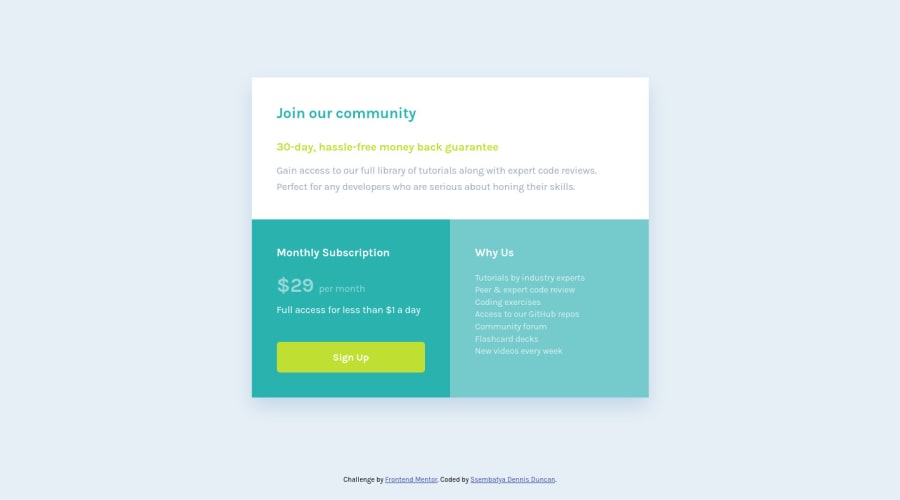
Responsive Single price grid component
Design comparison
Solution retrospective
Am very glad about my solution and the way am getting comfortable using CSS Grid, However I would really appreciate any feedback about my solution and areas to improve in my solution. I really love to improve my CSS skills I welcome any advise to improve. Thank you so much and wish you all happy coding.
Community feedback
- @VCaramesPosted over 2 years ago
Hey @ssembatya-dennis, some suggestions to improve you code:
-
The “30-day, hassle-free money back guarantee” is not a heading. It should instead be wrapped in a Paragraph Element.
-
Reduce the
font-sizeandpaddingin mobile view to accommodate smaller screens. -
Implement a Mobile First approach 📱 > 🖥
With mobile devices being the predominant way that people view websites/content. It is more crucial than ever to ensure that your website/content looks presentable on all mobile devices. To achieve this, you start building your website/content for smaller screen first and then adjust your content for larger screens.
Happy Coding! 👻🎃
0 -
Please log in to post a comment
Log in with GitHubJoin our Discord community
Join thousands of Frontend Mentor community members taking the challenges, sharing resources, helping each other, and chatting about all things front-end!
Join our Discord
