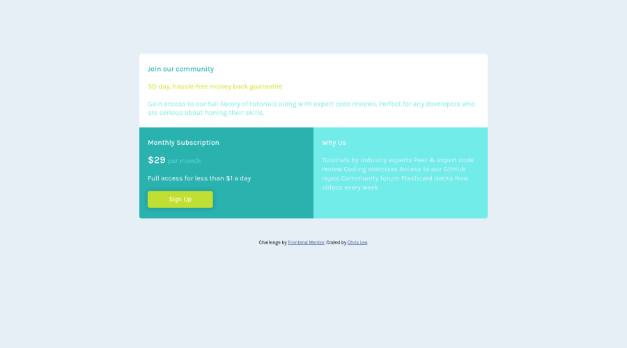
Design comparison
Solution retrospective
Currently, I am learning HTML, CSS and JavaScript by myself. If you can provide some feedback, I would be appreciated it.
Community feedback
- @HassiaiPosted over 1 year ago
Replace <div class="grid-container"> with the main tag, the first <p class="header"> with <h1> to fix the accessibility. click here for more on web-accessibility and semantic html
Every html must have <h1> to make it accessible. Always begin the heading of the html with <h1> tag wrap the sub-heading of <h1> in <h2> tag, wrap the sub-heading of <h2> in <h3> this continues until <h6>, never skip a level of a heading.
To center .grid-container on the page using flexbox, add min-height: 100vh to the body.
USING FLEXBOX:
body{
min-height: 100vh;
display: flex;
align-items: center;
justify-content: center;
}
Hope am helpful.
Well done for completing this challenge. HAPPY CODING
Marked as helpful0 - @0xabdulkhaliqPosted over 1 year ago
Hello there 👋. Congratulations on successfully completing the challenge! 🎉
- I have other recommendations regarding your code that I believe will be of great interest to you.
HTML 🏷️:
- This solution generates accessibility error reports, "All page content should be contained by landmarks" is due to
non-semanticmarkup, which lack landmark for a webpage
- So fix it by replacing the
<div class="grid-container">element with the semantic element<main>in yourindex.htmlfile to improve accessibility and organization of your page.
- What is meant by landmark ?, They used to define major sections of your page instead of relying on generic elements like
<div>or<span>
- They convey the structure of your page. For example, the
<main>element should include all content directly related to the page's main idea, so there should only be one per page
CSS 🎨:
- let me explain, How you can easily center the component.
- We don't need to use
marginandpaddingto center the component both horizontally & vertically. Because usingmarginorpaddingwill not dynamical centers our component at all states
- To properly center the component in the page, you should use
FlexboxorGridlayout. You can read more about centering in CSS here 📚.
- For this demonstration we use css
Gridto center the component
body { min-height: 100vh; display: grid; place-items: center; margin: 0; }- Now remove these styles, after removing you can able to see the changes
.grid-container {
    margin: 3rem 4rem;
}
.
I hope you find this helpful 😄 Above all, the solution you submitted is great !
Happy coding!
Marked as helpful0
Please log in to post a comment
Log in with GitHubJoin our Discord community
Join thousands of Frontend Mentor community members taking the challenges, sharing resources, helping each other, and chatting about all things front-end!
Join our Discord
