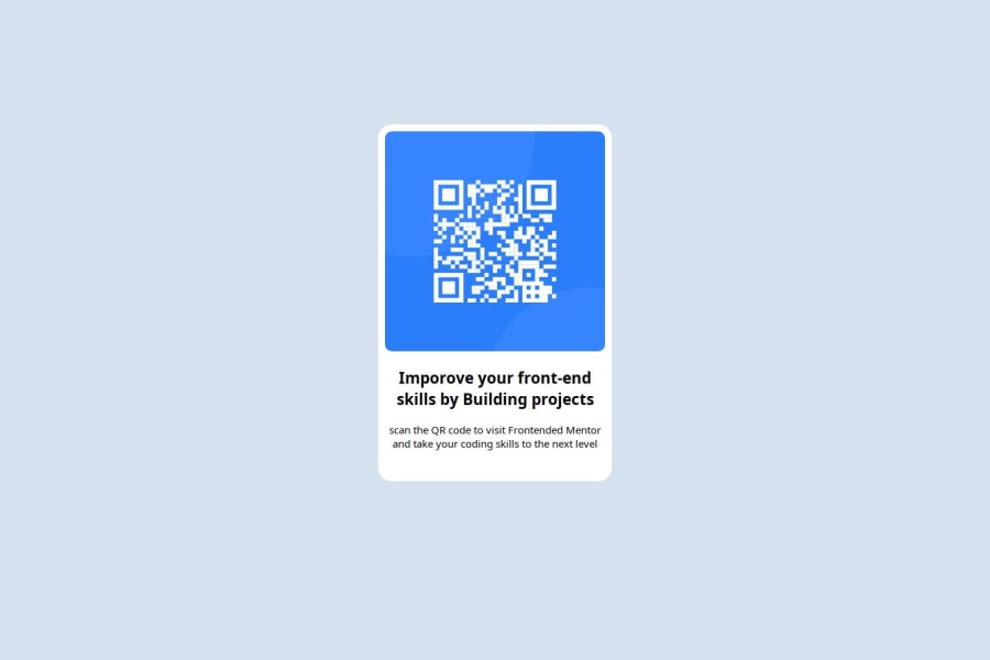
Responsive single page QR code Component using CSS Grid and Flexbox
Design comparison
Community feedback
- @LapupehPosted about 2 months ago
The solution includes semantic HTML as required and it is also accessible. I previewed the site, checked for the responsiveness and the layout looks good on a range of screen sizes. The solution does not significantly differ from the design. Good!
1 - @WasaanyiPosted about 2 months ago
Awesome job tackling this challenge! You’re doing amazing, and I wanted to share some suggestions that might help refine your approach…
Using a <main> tag inside the <body> of your HTML is a best practice because it identifies the main content of your page. This helps with accessibility and improves how search engines understand your content.
Using a full modern CSS reset is beneficial because it removes default browser styling, creating a consistent starting point for your design across all browsers. It helps avoid unexpected layout issues and makes your styles more predictable, ensuring a uniform appearance on different devices and platforms, check out this site for a Full modern reset
I hope you found this advice helpful! Keep up the great work, You’re doing amazing, and I can’t wait to see what you create next. Happy coding! 🚀
0
Please log in to post a comment
Log in with GitHubJoin our Discord community
Join thousands of Frontend Mentor community members taking the challenges, sharing resources, helping each other, and chatting about all things front-end!
Join our Discord
