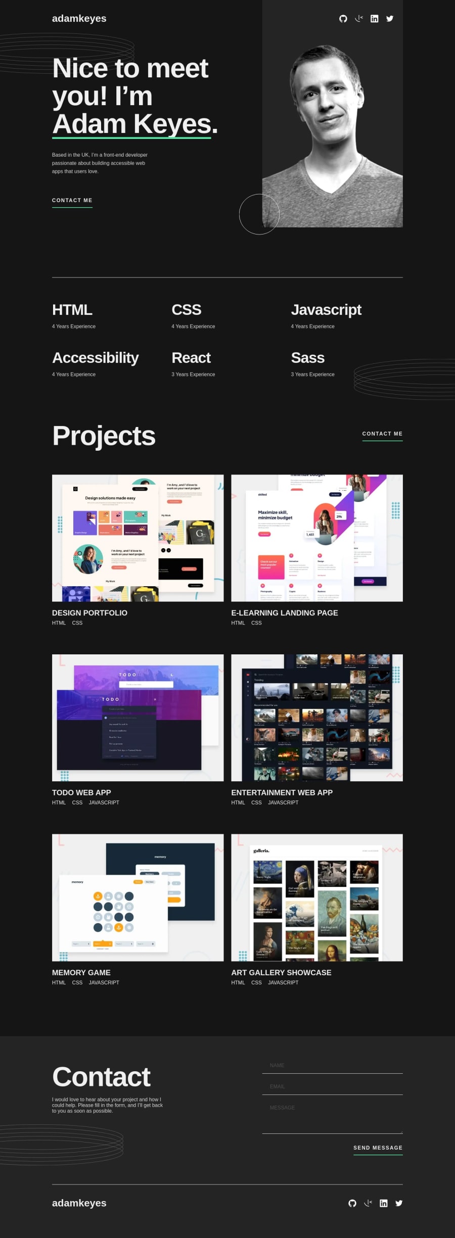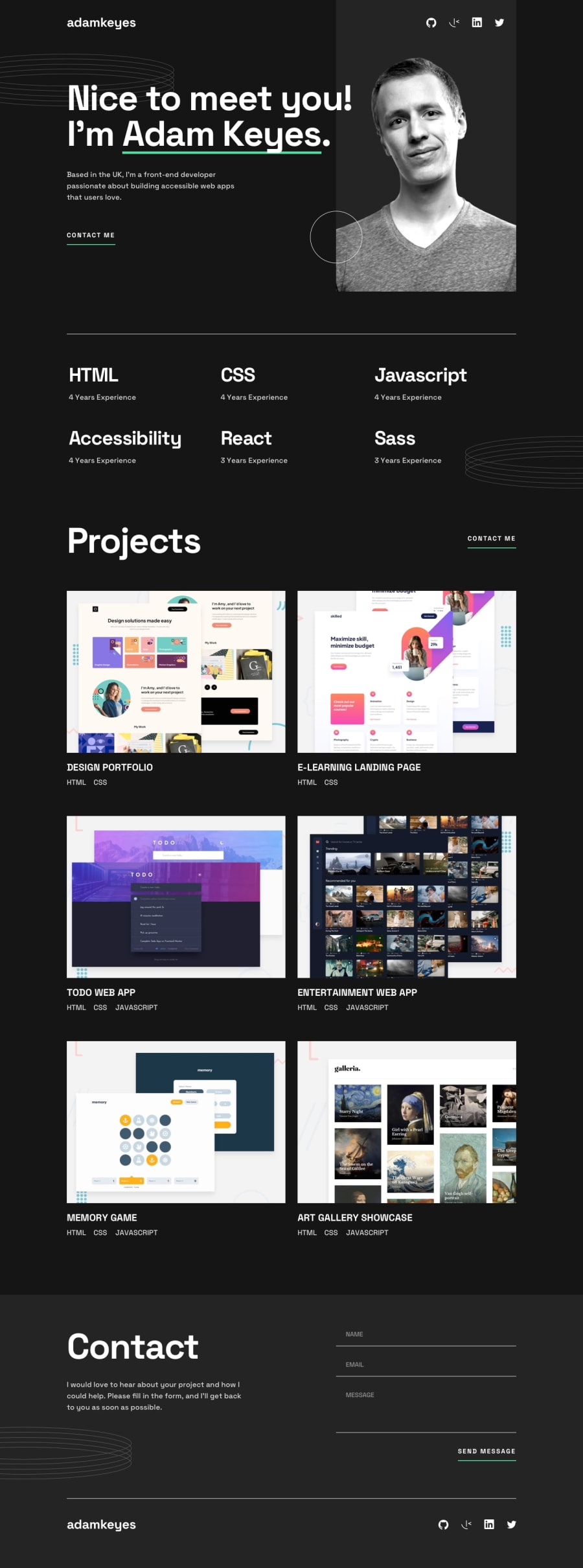
Design comparison
SolutionDesign
Solution retrospective
This challenge was useful firstly as a layout exercise, having different sections in which to test yourself and secondly, regarding the implementation of the contact form, managing the various inputs combined with error management. Precisely for this last aspect, it helped me a lot to better understand how the forms work, also useful for future cases.
For any info/questions/constructive criticism or simple feedback I am always available ;) Happy coding everyone
Community feedback
Please log in to post a comment
Log in with GitHubJoin our Discord community
Join thousands of Frontend Mentor community members taking the challenges, sharing resources, helping each other, and chatting about all things front-end!
Join our Discord
