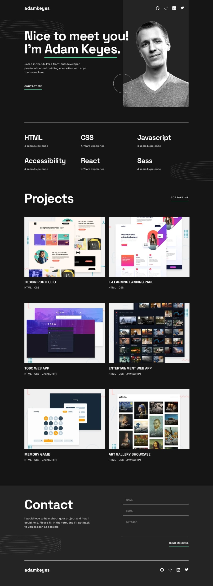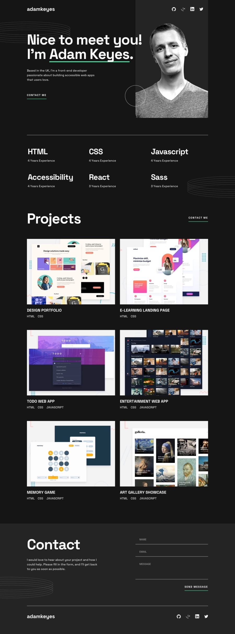
Design comparison
SolutionDesign
Solution retrospective
Frontend Mentor - Single Page Developer Portfolio
This is my solution to the Single Page Developer Portfolio.
Screenshot
Links
Built with
- Semantic HTML5 markup
- CSS
- CSS Flexbox
- CSS Grid
- CSS Animations
- JavaScript
Challenges
- Resizing and adding hover effects to svg icons
- Learning to use
<picture>and<source>for displaying images on various screen sizes i.e. using media queries - Image overlay for the projects section
- Learning to use keyframes to add animations
Feedback
Any constructive feedback is welcomed.
Community feedback
Please log in to post a comment
Log in with GitHubJoin our Discord community
Join thousands of Frontend Mentor community members taking the challenges, sharing resources, helping each other, and chatting about all things front-end!
Join our Discord
