Responsive simple recipie page using CSS and Html


Design comparison

Solution retrospective
The last section of nutrition, what is the best way to make it more project like ? using table or what ?
Community feedback
- P@finkusuma-devPosted 28 days ago
Yup, it should be using table for nutrition list. Where calories, carbs, protein, and fat are the row headers. Use
<th scope="row">so the screen readers mark it as row headers. Here is the MDNthdocumentation with examples.# Other Suggestions
## Using the correct semantic
You should put the solution inside an
articleelement, because this post about the recipe can be indenpendently distributable. You can read more about thisarticleelement on MDNarticledocumentation.Then put the
articleinsidemainelement, as it indicates the primary content of the page.If you want to show the attribution you can put it inside
footerelement.<body> <main> <article class="container"></article> </main> <footer class="attribution"></footer> </body>## Make the image expand through the container paddings
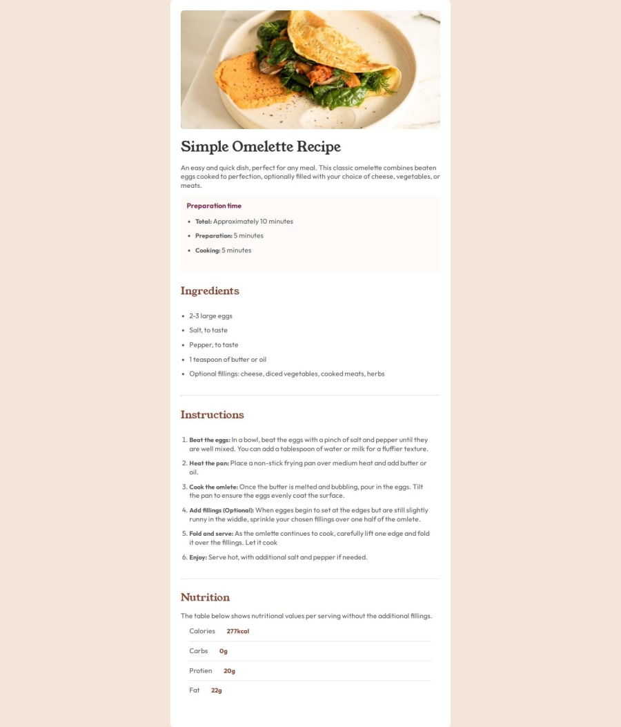
On the mobile screen, the image should have no left, right, and top paddings. You can see this on the
mobile-design.jpgon thedesign/folder on the starter files provided.To achieve this you can use negative margin on the image element, and extend the width of the image by adding the left and right container padding values.
.container {
  /* Use this value as a reference to extend the image width */
  padding: 32px;
}

@media (max-width: 480px) {
  .container {
    max-width: 100%;
    border-radius: 0;

    /* As you can see on the mobile design, the container doesn't have the top padding */
    padding-top: 0;
  }

  .container img {
    /* Extend the width by adding left & right container padding values*/
    width: calc(100% + (2 * 32px));

    /* Position the image to span across the left and right container padding */
    margin-left: -32px;
    margin-right: -32px;

    /* Remove border radius on the image*/
    border-radius: 0;
  }

  body {
    padding: 0;
  }
}
## Use the heading elements correctly
You've correctly set the
h1heading on the page title "Simple Omelette Recipe". But you must fix the other headings. These are the list of corrections I could find:-
The page must only have one
h1element. So the others must beh2orh3. -
You shouldn't skip heading from
h1toh3. Headings are used to structure the page, so the headings must be in order, fromh1,h2,h3. You shouldn't choose theh3heading instead ofh2just becauseh3has font size you wanted. Use CSS to style theh2if you want to change how big the text is. You can read more about this on FEM mentor post on the heading order. -
I saw you put
h3inside the list-item. You should never do this. Use the headings to title the sections. Don't use it for other purposes like to make some text looks big and bold. If you want to style some of the text inside list-item, you can usespanelement and style it using CSS.
## Use CSS custom properties
To make setting the color easier you could use CSS custom properties to store the color values as described in the style-guide.md. Then use the custom properties using
var()function.:root( --color-rose-800: hsl(332, 51%, 32%); ) h2 { color: var(--color-rose-800); }## Coloring the list-item markers
You haven't set the color of the list-item markers. To do this you could use
::markerpseudo element.::marker { color: var(--color-Rose-800); }Marked as helpful1@qayoommunawarPosted 28 days ago@finkusuma-dev Damn dude, you are really a legend. Thank you for your suggestions. I am really gonna take care of these next time.
0 -
- @shiroblsdPosted 28 days ago
good job, but you're missing indents at the beginning and end of the page.
good luck with your next project! bye
0


Please log in to post a comment
Log in with GitHubJoin our Discord community
Join thousands of Frontend Mentor community members taking the challenges, sharing resources, helping each other, and chatting about all things front-end!
Join our Discord