Responsive Simple Recipe Page

Solution retrospective
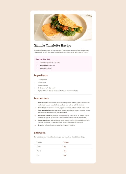
I'm proud of the project in global. Even if it's a simple project, I still used energy and time for it, and seeing the result, I'm proud of it. I'm also proud of the style in the list marker. I didn't know that when I started the challenge. I'm glad I solved it.
I think I will try to organize my CSS the next time. If I continue like this, it's will be unmaintanable, especially on a large project.
What challenges did you encounter, and how did you overcome them?Like I said in the README, the main challenge I've got was how to style the list marker for the recipe steps. I took a few minutes to search on Google how to solve this problem, and MDN Docs helped me! If your curious, I put the link to the specific article that helped me in the README of my solution.
What specific areas of your project would you like help with?If you have to give me a feedback, the most important feedback you could give me is :
- Did I have good practices with the technologies I used ?
- What do you think of my code and my README in globality ?
- Do you have any advice or recommendation to share that can help me progress ?
Please log in to post a comment
Log in with GitHubCommunity feedback
No feedback yet. Be the first to give feedback on Sephirah Chesed's solution.
Join our Discord community
Join thousands of Frontend Mentor community members taking the challenges, sharing resources, helping each other, and chatting about all things front-end!
Join our Discord