Not Found
Not Found
Not Found
Not Found
Not Found
Not Found
Not Found
Not Found
Not Found
Not Found
Not Found
Not Found
Not Found
Not Found
Not Found
Not Found
Not Found
Not Found
Not Found
Not Found

Submitted

Responsive simple recipe page

@steffieMD

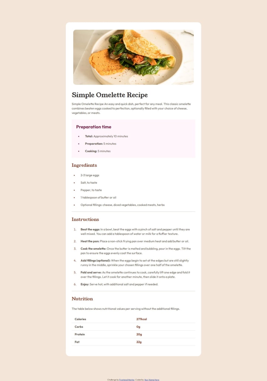
Desktop design screenshot for the Recipe page coding challenge

This is a solution for...

  • HTML
  • CSS
1newbie
View challenge

Design comparison


SolutionDesign

Solution retrospective


What are you most proud of, and what would you do differently next time?

I'm getting a lot better at using a mobile first workflow

What challenges did you encounter, and how did you overcome them?

I initially found it hard with the list text wrapping under the bullet points. Thank God for stackoverflow lol!

Community feedback

P
Steven Stroud• 4,100

@Stroudy

Posted

Hey great job getting it so close to the original, some things I noticed,

  • Missing a <meta> description tag for SEO purposes,
  • Setting a height and width attribute to your <img> will increase performance to reduce layout shifts and improve CLS, It reserves the space on the page for the image,
  • Line height is usually unitless instead of line-height: 150%; should use line-height: 1.5; this means it is 1.5 x the font-size, unitless value ensures that the line height will scale proportionately.
  • You should also use relative units for @media aswell,

Smashing it, Great code in all honesty, I hope you found some of this information helpful, You should give the articles a good read and I look forward to seeing some more from you, Happy coding! 💻

0

@steffieMD

Posted

@Stroudy

Hiiii, thank you so much! I'll get on this. Thank you so much for the info on the line-height! i'll definitely take note.

Regarding the height of the image, i thought fixed <img> heights can tamper with the responsiveness of the page. Also, for the media queries the only place i didn't use relative units was the border radius. I'm meant to use relative units there as well yeah?

Again, thank you sooo mucch :)

0
P
Steven Stroud• 4,100

@Stroudy

Posted

@steffieMD, Hey,

  • HTML, It provides a fallback size for browsers, Settting the width and height attributes to define the intrinsic size of the image. This helps the browser allocate space for the image while it's loading, reducing layout shifts.
  • Use CSS to control the image size responsively, ensuring it looks good across all devices.

Hope this was a good explanation and helpful, Happy Coding!

Marked as helpful

0

Please log in to post a comment

Log in with GitHub
Discord logo

Join our Discord community

Join thousands of Frontend Mentor community members taking the challenges, sharing resources, helping each other, and chatting about all things front-end!

Join our Discord