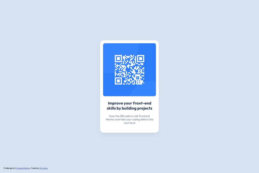
Design comparison
Solution retrospective
I am proud to have made a project that seems to adapt to different screen sizes.
What challenges did you encounter, and how did you overcome them?Finally figured out why I couldn't align an element vertically to the entire page. I just had to put these lines of code to get it done:
html, body, main {
width: 100%;
height: 100%;
}
And then drag these lines to center the element:
.qr-code-box-container {
display: flex;
justify-content: center;
align-items: center;
height: 100%;
}
It's very simple but I really struggled with it before.
What specific areas of your project would you like help with?Does the final result visually match what was requested ? Is the code well organized ?
Community feedback
- @MikDra1Posted 3 months ago
If you want to make your project just like the design I encourage you to use the Pixal Perfect extension
Hope you found this comment helpful 💗💗💗
Good job and keep going 😁😊😉
Marked as helpful1 - @geomydasPosted 3 months ago
There isn't really a need to wrap each element inside a div wrapper. Just apply the styles themselves directly. It's reccomended to not a set a fixed with (width: whateverpx) since it makes your code unresponsive to different screensizes. What I would do is set a max-width instead.
You should also make use of the rem unit instead of the px unit. What the rem unit does is that it makes your sizes change depending on the users set font size which is crucial for accesiblity. See why
To decide when you should use rem in place of px, ask yourself "Do I want to scale up when the user changes their font-size". If yes, use rem. Else, use px instead.
Lastly, use a CSS reset. It basically makes your CSS look the same on almost all devices and it makes your life much more easier aswell. Most people use either Andy Bell's or Josh Comeau's one.
Summary
- Apply some the styles to element itself instead of adding a div wrapper
- Use rem instead of px in most cases
- Use a CSS reset
Marked as helpful1 - @TedJenklerPosted 3 months ago
Hi @MrLanter,
Nice project! Here are a few suggestions for improvement:
Reduce Nesting: As mentioned in previous feedback, your code could benefit from reduced nesting. Any element, including html and body, can be a flex or grid container. This can help you avoid unnecessary div elements and simplify your structure.
ARIA Labels: It’s great that you’re using the main element for accessibility. When semantic HTML doesn’t make sense, adding aria-label="" attributes can enhance readability for screen readers and significantly improve accessibility.
Clickable QR Code: For accessibility, especially for older users, consider making your QR code a clickable link as well. I work part-time in customer service, and I've seen that many people struggle with scanning QR codes. Although it might be outside the project scope, it’s a thoughtful touch that can enhance user experience.
Hope you find these suggestions helpful!
Best, Teodor
1@geomydasPosted 3 months ago@TedJenkler I don't suggest that you use an aria-label here. No aria is better than bad aria. The content is enough already and you would only use aria-label when you feel like it doesnt give enough info for screen readers. You can use .sr-only but once again, this challenge doesn't need it
0@TedJenklerPosted 3 months ago@geomydas Well, I can’t claim to be a master of accessibility, so I could be wrong, but adding ARIA labels to important parts of a site or component can greatly improve user navigation. In larger projects, ARIA labels also make it much easier to test the code using Cypress and Jest. While you’re arguably correct that this project could function without them, it’s good practice to add ARIA labels to most divs. Divs that don’t need them can often be removed altogether.
0@geomydasPosted 3 months ago@TedJenkler I'm no accesibility expert aswell but I think you can also use aria-description or aria-describedby in place of aria-label. Visually-hidden may work aswell but for most of the time aswell, semantic html tags are enough. Also, I think this may help
1@TedJenklerPosted 3 months ago@geomydas
Interesting for sure. I must admit I haven’t used ARIA labels extensively in many of my projects, so it’s something I’m slowly transitioning to. Generally, when an element can’t be described by semantic HTML, adding an ARIA label is beneficial. While choosing the best ARIA attribute variant is important, the basic ARIA label is the easiest to remember, especially for beginners.
(As mentioned before ARIA labels also simplify testing with Jest and Cypress, which is a hidden advantage.)
Additionally, ARIA labels or their variants can improve SEO and searchability. Even if ARIA labels seem trivial or excessive, search optimization tools will navigate your page more effectively. Using <div> elements sparingly and adding ARIA labels to describe their purpose takes just a few seconds and enhances your code. Incorporating various ARIA attributes, as you described, can make it even better.
P.S. I might have used ARIA labels and aria attributes interchangeably, but it’s interesting to learn about the different options available. As a beginner, I’d start with ARIA labels and add attributes like aria-describedby later. It’s an interesting discussion, and I’ll explore accessibility further and test with screen readers to see the results.
Have a nice day @geomydas
0@geomydasPosted 3 months ago@TedJenkler Have a nice day too! I've learnt something atleast from this discussion
1 - @M-Taha-AminPosted 3 months ago
Nice one bro, I took a look at your code also. It is well organized and you have made use of correct semantics tags too, like footer and main, etc. Also, your solution is very close to the specified design. Great work!
1
Please log in to post a comment
Log in with GitHubJoin our Discord community
Join thousands of Frontend Mentor community members taking the challenges, sharing resources, helping each other, and chatting about all things front-end!
Join our Discord