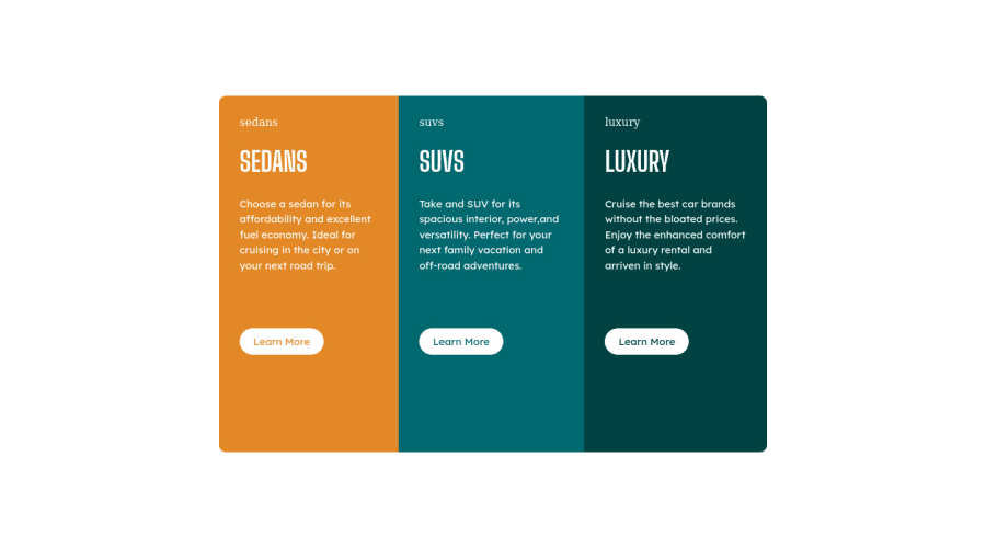
Design comparison
Solution retrospective
This is one of my first work using HTML and CSS. Please give me some advice on the structure HTML and CSS styling if there are any better ways/approach. Thank you!
Community feedback
- @correlucasPosted about 2 years ago
👾Hello @Mikkobelly, congratulations for your new solution!
I saw your solution and I've some tips for you regarding the html markup:
Make the rounded borders with
border-radius
for the first and the last card. You made your html structure entirely withdiv blocks
but these div doesn't any semantic meaning, for this reason is better you use a better html markup improving your code, for example for each vehicle card you use<article>
instead of the<div>
. This article from Freecodecamp explains the main HTML semantic TAGS: https://www.freecodecamp.org/news/semantic-html5-elements/👨💻Here's my solution for this challenge if you wants to see how I build it: https://www.frontendmentor.io/solutions/3-column-preview-card-vanilla-css-custom-design-and-hover-states-e5uAfmUT71
Marked as helpful0 - @PhoenixDev22Posted about 2 years ago
Hi M A,
Congratulation completing another frontend mentor challenge. I have some suggestions regarding your solution:
- About
<h1>
it is recommended not to have more than one h1 on the page. Multiple<h1>
tags make using screen readers more difficult, decreasing your site’s accessibility. In this challenge, as it’s not a whole page, you can have<h1>
visually hidden withsr-only
. Then you can swap those<h1>
with<h2>
.
- In my opinion, the images are much likely to be decorative. For any decorative images, each img tag should have empty
alt=""
andaria-hidden="true"
attributes to make all web assistive technologies such as screen reader ignore those images.
role="img-sedans"
?? I suggest to read more about what role attribute is and what it’s used for.
- What would happen when the user click those learn more? In my opinion, clicking those "learn more" would likely trigger navigation not do an action so button elements would not be right. So you should use the <a>. For future use , it's a good habit of specifying the type of the button to avoid any unpredictable bugs.
- Don't capitalize in html, let css text transform take care of that. Remember screen readers won't be able to Read capitalized text as they will often read them letter by letter thinking they are acronyms.
Great job on this one. Hopefully this feedback helps.
Marked as helpful0@MikkobellyPosted about 2 years ago@PhoenixDev22
Thank you so much for your feedback. These kind of feedback are very valuable. I'll study more deeply about what role attribute is for. I didnot think of using <a> instead of <button> and it made me realize how important to really think of the meaning and use right HTML tags!
0@PhoenixDev22Posted about 2 years ago@Mikkobelly
Glad to hear that it was helpful. Happy coding!
0 - About
- @hyrongennikePosted about 2 years ago
Hi,
Congrats on completing the challenge and great job just one small thing I picked up there's quite a bit of white space under the button more than what is present in the design that's because you set a
min-height: 65vh
on the .main-container and because it's a flex container by default children stretch to the height of the parent so to fix that you just need to add the following to your .main-container.display: flex; justify-content: center; align-items: center;
This is just something to keep in mind for future challenge and projects.
Marked as helpful0@MikkobellyPosted about 2 years ago@hyrongennike Thank you for your feedback! This is very helpful.
0
Please log in to post a comment
Log in with GitHubJoin our Discord community
Join thousands of Frontend Mentor community members taking the challenges, sharing resources, helping each other, and chatting about all things front-end!
Join our Discord