Design comparison
Solution retrospective
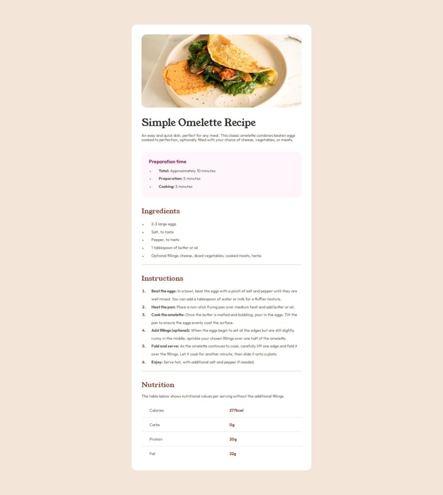
I used a little grid to get around an aligning issue I came across in the preparation container. Besides that, I didn't use anything out of the ordinary just normal mark up and CSS.
I went of the JPEG image that came with the original challenge so it's not 100% accurate. I aimed to use only rem units because its something I want to get more familiar with instead of relying on absolute units, so I had to guess quite a fair bit.
(Without the Figma files at hand i'll be happy with a 70% match on this one)
Some parts were a bit difficult to around, in order to make them responsive; these being:
The HR (.separator). The lines separating the table rows. In the end I managed to make them work, sort of, but I can't help but get the feeling that there's a better way of doing it than the way I did. If you have some suggestions and tips for those issues in particular I would be grateful, since I couldn't find much online about it (probably not googling the right things, to be honest), as well as other things you guys can point out in the general design.
Community feedback
Please log in to post a comment
Log in with GitHubJoin our Discord community
Join thousands of Frontend Mentor community members taking the challenges, sharing resources, helping each other, and chatting about all things front-end!
Join our Discord
